Graphic Elements
Frame
The content frame is a graphic hallmark of the “On to Something” brand execution. With the frame we highlight and focus viewers’ attention on the moment of discovery and understanding.
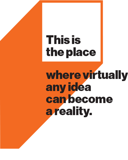
Closed Content Frame
The graphic is simple in its structure and application. However, there are a few suggestions for its proper use. Notably, it doesn’t need to be used in every layout. Consider its meaningfulness to the overall piece and don’t overuse it, thereby watering it down.

3" or 5" Squares
Typical Frame Line Weight
14 pt. line thickness on an 8.5″x11″ printed page
Scale Limit
Frame should not exceed 2/3 of the printed page width
The frame is also a starting point for a range of graphic elements seen in the following sections of this page, and extends the visual language of the brand
Due to the range and scale of materials that might use the frame, some best practices are shown on this page to help with consistency.
Examples
Focusing Photography
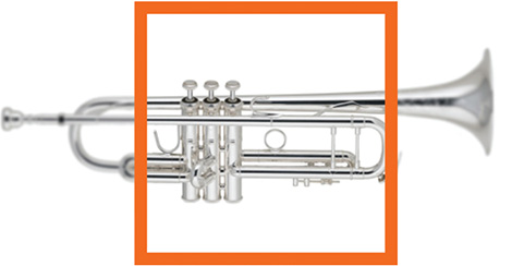
The frame can also be a focusing tool to highlight clarity of action or skill. Within the frame, the object is sharp; outside, it’s blurred. This application works best with object photos.
Highlighting Messaging
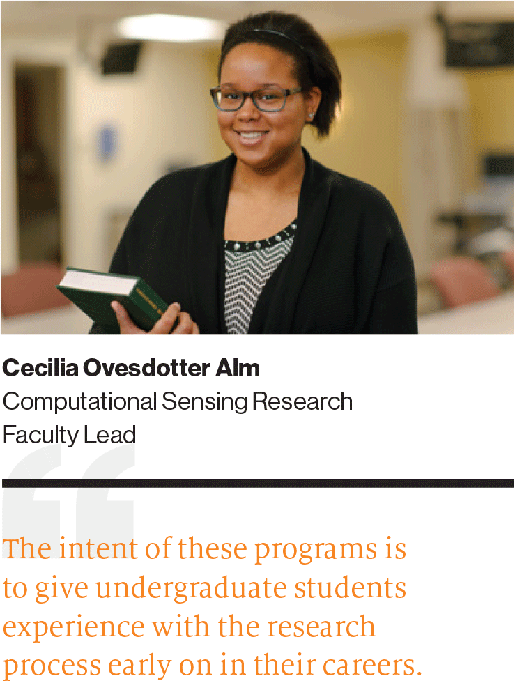
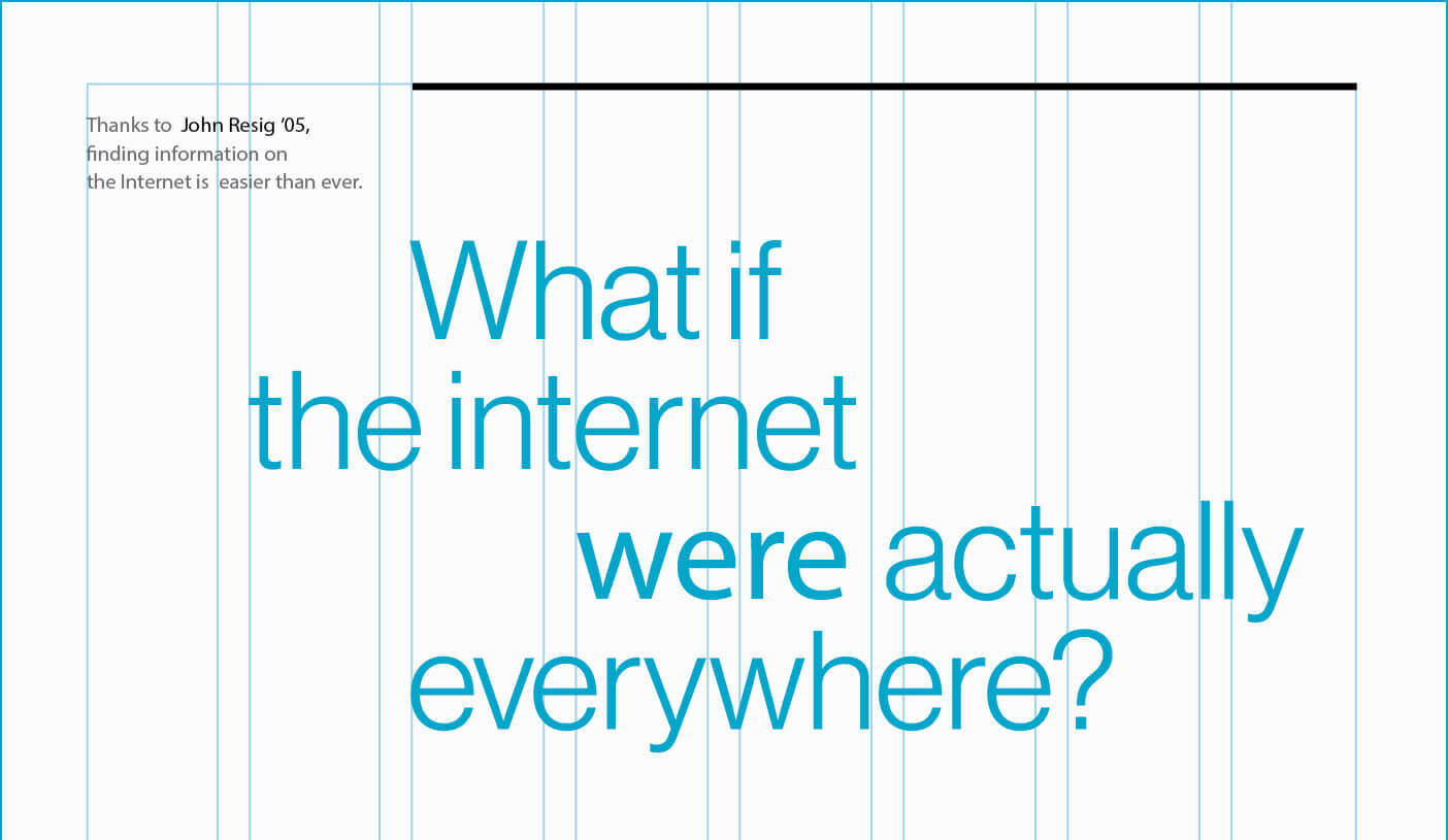
The frame can be used to focus a point or idea in text as well.
Highlighting Photography

Nearly any photo subject can be the target of the frame. The best photos have multiple elements of interest. Therefore, a simple portrait might not be the best composition for a frame.
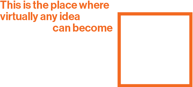
Open Content Frame
By opening up the content frame to copy, we can highlight larger messages in a fresh way. We can also pair the frame with a photo box to create strong messaging and image compositions.
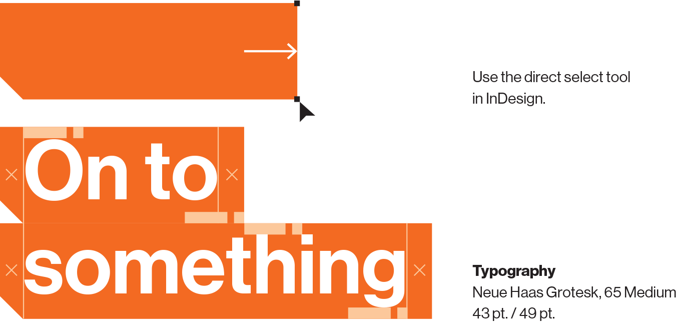
Type Intersection
For longer messages, open up the content frame starting at a corner where the intersecting vertical and horizontal rules can meet the copy elements. Try to make the construction interesting, using the sliding headline treatment. Try to align the frame to the headline.
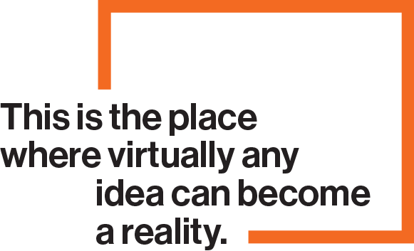

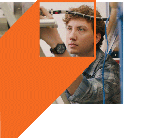
Photo Intersection
Pair photo boxes with an open content frame similar to type, shown above. Don’t use open content frame over larger underlying photo. Instead use the closed content frame.
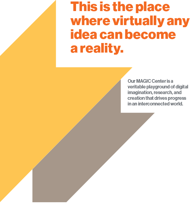
Moving Content Frame
To add motion and excitement to a layout, think of the square frame as a moving object rising up or sliding down to meet the area of focused discovery.
For Type
The moving content frame functions in a similar way to a normal closed content frame. Words inside the frame are limited but additional copy can reside on top of the rest of the graphic.
For Photography
Use the moving content frame in the same manner as the ordinary content frame.
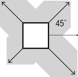
Extending the Frame
Extend the frame block at 45-degree angles only.

Energizing Layouts with Color
Extend a square at a 45-degree angle for any length suited to the layout, and use the multiply effects palette in InDesign. The results are best over lighter photography and white space of the layout.
Simple Structure
The moving block overlay is a simple stretching of a square in a 45-degree direction. All sides should be parallel. It can vary in scale and more than one can occupy a layout. Look for alignment opportunities with other block overlay graphics and other elements.
For Type
An open-ended panel at the top of the structure suggests three-dimensionality in the graphic and placement of messaging further enhances it. Placing one frame edge next to another adds even more depth to the layout.
For Photography
A simple square image at the top makes this graphic a strong component to the layout.


Vertical
The choice of the vertical bracket may depend on the layout or the accompanying messaging.
Two advantages of this graphic element:
the option of using only one side of the bracket (as seen in this document) and the option of elongating the bracket to align with elements.

Horizontal
The horizontal bracket, used less frequently, offers an option for organizing photos and typography.
Examples
Object Bracket
While it can be effective with larger photo compositions, the single bracket works best with object photos. It’s also a good anchor for supporting copy.
Text Bracket


When paired with cropped photos, the bracket can be useful for creating structural support.
Instead of lightweight rules, a bracket with supporting text can be an eye-catching tool for the job.
Headline Treatments
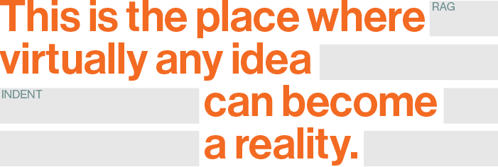
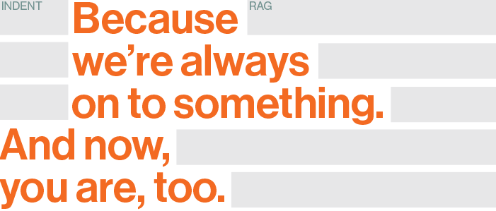
Sliding Headlines
To create more emphasis and add visual expression to layouts, we can shift the lines of a headline.
3 Lines (minimum)
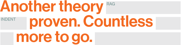
This is the best number of lines for creating a dynamic effect. Each line may have its own starting position with less extreme shifts.
4 Lines
As the number of lines increase, a simpler strategy is taken for shifting groups of content.
5 Lines (maximum)
Here, the layout explores how lines of type are grouped according to the syntax, and what phrases are emphasized.
Color Block Callouts
This treatment goes directly to the key words we express when we are “On to Something.” Choose provocative words or phrases and apply a color block instead of simply bolding a word. This blunt application adds energy to material for younger audiences.
Usage
Avoid using the sliding headline treatment and color blocks together. Use the diagram to ensure correct spacing of elements. The block shape is custom built to surround individual words or phrases. Lengthen the block from the right corner anchor point to ensure proper shape.
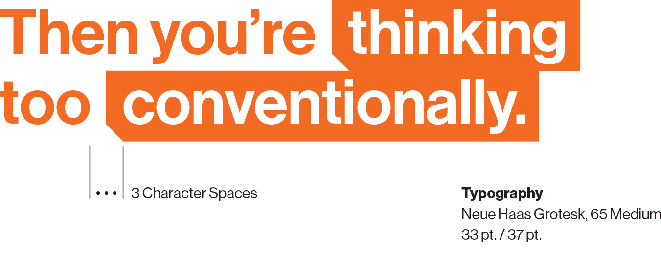
Photo Container Graphics
These are some of the most expressive visual applications for the brand. It starts with seeing the things we do through a window of language. Incorporate these treatments sparingly and meaningfully to enhance the content and storytelling.
Typographic
Compressing the letterforms together creates more continuous space for photography to be uninterrupted.

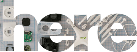
Special Characters
Additional glyphs can support this expression, creating a more abstract structure or connection to storytelling.


Effective glyphs for container graphics obtained from Neue Haas Grotesk Pro, 95 Black
)]}>!=#*&’:
Grid Structure
Think of grids as the foundation for our design structures. They anchor all the elements on each individual page, and give our diverse range of communication pieces a common backbone.
The grid system provides you with tools to create infinite combinations of text and images. We use it to create layouts that are aligned and balanced, ensuring that all our pieces of communication look refined and professional.
Column Options
There are four standard column grids to choose from: 2-column, 3-column, 4-column, and 6-column. The content and layout of each piece will decide which grid works best in a given situation.
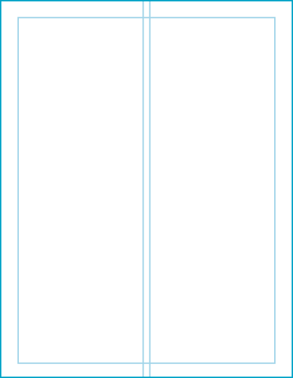
2-column grid
8.5"x11"
Common Uses
- Covers, long passages of text, text and images
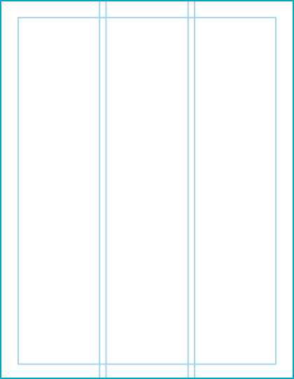
3-column grid
8.5"x11"
Common Uses
- Covers, long passages of text, text and images
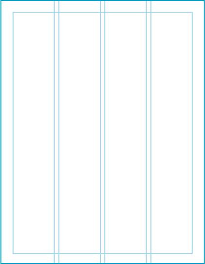
4-column grid
8.5"x11"
Common Uses
- Complex layouts of text, images, and graphics
- Pages with a lot of callouts, details, stats
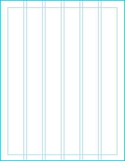
6-column grid
8.5"x11"
Common Uses
- Complex layouts of text, images, and graphics
- Pages with small text
Column and Accent Rules
Rules are a simple way to add structure to a page, to divide content, or to connect content in different areas of a layout.
Weight
Even though rules look rather simple, applying them thoughtfully can elevate a design. One easy method is to use a common weight throughout an entire piece of collateral.
For standard print pieces (approx. 8.5” x 11”), rule weight should be set to 0.5 points or 3 points and should not exceed 4 points. This rule of thumb can be scaled up proportionally for larger pieces.
Grid-Aligned Rules
Usually appearing at the top margin, bottom margin, or both margins of a page layout, these horizontal rules guide the reader and separate sidebar content from the main content.
Content-Highlight Rules
These horizontal rules provide structure for callouts or labels on a smaller scale. They may not always connect with the underlying grid structure, but they’re an important part of controlling hierarchy.