Typography
Font Families
Typography is a robust vehicle for our brand voice. It contributes to how our messages are read and communicated. Neue Haas Grotesk is our sans-serif family and a workhorse for our communications. Milo, our serif family, performs well at small sizes, in longer-form text, and in more sophisticated applications. Used together, these two typefaces create a clear hierarchy and keep our content legible and engaging.
Neue Haas Grotesk is available free in Adobe Cloud, you can reach out to ITS for help downloading it onto your computer. Milo Serif is a licensed font, please email brand@rit.edu if you require this font as licenses are limited.
For web use, please use the following font stack:
font-family: "Helvetica Neue", "Helvetica", "Roboto", "Arial", sans‑serif
Neue Haas Grotesk
Neue Haas Grotesk, our sans-serif face, is the brand’s most prominently used typeface. As pragmatic as it is friendly, Neue Haas Grotesk is suited for headlines, subheads, body copy, and captions. Note that the black, medium, and light weights of the font work best in headlines, while the roman weights are better for body copy.
To request this font, please reach out to ITS. The font is free through Adobe Cloud.
45 Light
45 Light Italic
55 Roman
55 Italic
65 Medium
65 Medium Italic
75 Bold
75 Bold Italic
95 Black
95 Black
Milo Serif
Milo Serif is our secondary typeface. Its sophisticated tone and high legibility make it extremely versatile. Because it’s easy to read at a variety of weights, it works great for subheads and body copy, and pairs beautifully with Neue Haas Grotesk.
To request this brand typeface, please email brand@rit.edu. Please know limited licenses exist for this font.
45 Light
45 Light Italic
55 Roman
55 Italic
65 Medium
65 Medium Italic
75 Bold
75 Bold Italic
95 Black
95 Black
Alternate Font Systems
Our brand typefaces may not always be available to everyone for use in Word documents, PowerPoint presentations, and other digital applications.
In these situations, use the alternate fonts listed here, which are freely available on all computers.
Arial is the acceptable PC substitute for Neue Haas Grotesk.
Brand Fonts
45 Light
46 Light Italic
55 Roman56 Italic
Substitute Fonts
Arial Regular
Arial Italic
Brand Fonts
65 Medium
66 Medium Italic
75 Bold
76 Bold Italic
95 Black
96 Black Italic
Substitute Fonts
Arial Bold
Arial Bold Italic
Georgia is the acceptable PC substitute for Milo Serif.
Brand Fonts
Regular
Regular Italic
Text
Text Italic
Substitute Fonts
Georgia Regular
Georgia Italic
Brand Fonts
Medium
Medium Italic
Bold
Bold Italic
Substitute Fonts
Georgia Bold Bold
Georgia Bold Italic
Leading
Using type thoughtfully is crucial to making our designs look professional. Follow these tips to make sure our typography is consistent.
Line spacing, called leading, is critical to setting professional-looking type that’s easy to read. Leading should be set tight, but not too tight. With our typefaces, text generally looks best with the leading set slightly looser than the default.
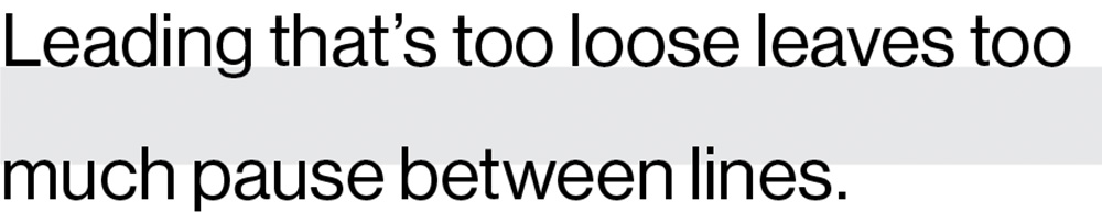
21pt. type/36pt. leading
This leading is too loose.
Alibus in et moditatque et quae venda volut lis nonse comniscit ullis estis solent odissitis audicipis.
8pt. type/15pt. leading

21pt. type/18pt. leading
This leading is too tight.
Alibus in et moditatque et quae venda volut lis nonse comniscit ullis estis solent odissitis audicipis.
8pt. type/9pt. leading
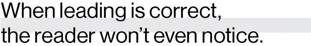
21pt. type/23pt. leading
This leading is correct.
Alibus in et moditatque et quae venda volut lis nonse comniscit ullis estis solent odissitis audicipis.
8pt. type/11pt. leading
Tracking
Correct letter spacing, called tracking, also makes the type easier to read. Outside of headlines, text should always be tracked slightly tighter than the default setting, and optical kerning should be used when it’s available.
When working with type, always take the time to make these adjustments. These details make us look professional and greatly improve the readability of our type.
![]()
21pt. type/130 tracking
This tracking is too loose.
Alibus in et moditatque et quae venda volut lis nonse comniscit ullis estis solent odissitis audicipis.
8pt. type/125 tracking
![]()
21pt. type/-75 tracking
This tracking is too tight.
Ibus dam, sunt quatqui quo velecum rest , que etum haritoptata vel int lore psum.
8pt. type/-30 tracking
![]()
21pt. type/0 tracking
This tracking is correct.
Alibus in et moditatque et quae venda volut lis nonse comniscit ullis estis solent odissitis audicipis.
8pt. type/10 tracking
Selecting the correct "R"
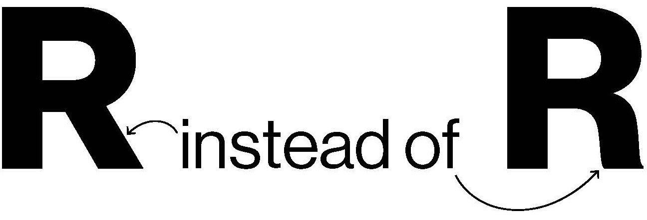
For headlines, subheads, or prominent text for print pieces, select the correct R. Web fonts do not have alternatives.
The capital R in Neue Haas Grotesk has two forms. The default is a curvy-leg R, and the alternate is a straight-leg R. The preferred version to be used is the straight leg R, particularly when used for headings, subheads, any prominent text or call-outs, and whenever spelling RIT or Rochester Institute of Technology, as the straight-leg R is more similar to the leg in the RIT logo. When using Neue Haas the straight-leg R is also preferred for copy text. (In situations where the straight-leg R is unable to be used, it is acceptable to use the curvy-leg R instead.)
If you are using InDesign:
To individually change characters:
To change a Neue Haas curvy-leg capital R to the straight-leg R, select the capital R with the text tool, leave the mouse over the character, and wait a moment. An opentype box showing the alternate R will appear in the lower right corner of the character. Mouse over the revealed straight-leg R and click. The capital letter will be replaced with the straight-leg R.
To permanently change the default set used in InDesign for all new InDesign documents:
(It is possible to change the default settings in InDesign so that all newly created documents will use the straight-leg R. However, this will not adjust the Rs in already created documents.) To permanently change the R used in InDesign to the straight-leg R, close all open InDesign documents and have InDesign open. In the menu, select Window—Type and Tables—Character. In the Character dialog box, in the options menu (in the window’s upper right corner) select Opentype—Stylistic Sets—Set 1. The straight-leg R will now be used in all newly-created InDesign documents.
If you are using Microsoft Word:
To change a Neue Haas curvy-leg capital R to the straight-leg R, select the R to be changed, and select Format—Font in the menu. Click the Advanced tab. Under Advanced Typography, in the Stylistic sets: option, choose 1. This will change the curvy-leg R to the straight-leg R. If you continue typing, the straight-leg R will continue to be used in this document.