Website Design and UI
All official RIT websites will utilize the approved website design, which include specified layouts and fonts comprising the following elements:
Header
- RIT logo lockup
- Site name
- Persona bar - Future Students, Current Students, etc. (optional on microsites)
- Calls-to-action - Inquire, Visit, Apply, Give (optional on microsites)
- Contextual global links - News, Directory, myRIT (optional on microsites)
- Primary navigation links
- Search icon
- Secondary navigation dropdown, if applicable (limited to 12 links; 10 text-based and 2 image-based links)
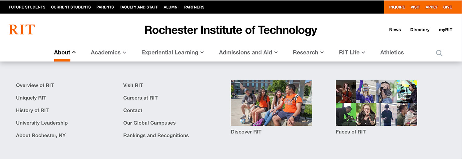 click to enlarge
 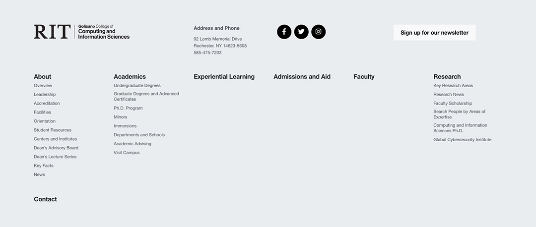 click to enlarge
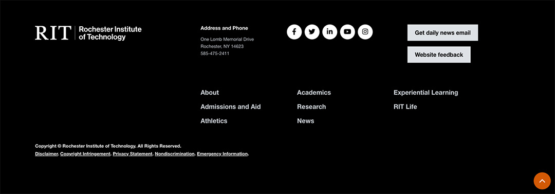
Other elements and resources
- Official RIT Favicon
- Buttons
Solid orange
Solid gray
Orange outline - Typography
- Color
- Icons
- On-brand photography
- UX features (e.g. sticky page navigation, accordions)
- Responsive specific UI/UX