Brand Kit Poster
Design in Series: Creating Cohesive Visual Systems
This project challenges students to develop a visual series—such as posters, packaging, or branding variations—using a consistent style, color palette, and composition. Each design functions independently while clearly belonging to a unified set. The assignment emphasizes creative iteration, thoughtful refinement, and critical reflection on how visual consistency is achieved through deliberate design decisions. The result is a cohesive collection that demonstrates both conceptual clarity and aesthetic harmony.
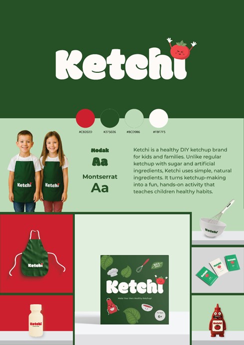
Reem Chaaban
This project allowed me to create a cohesive visual identity for “Ketchi,” a healthy DIY ketchup brand for children. I focused on maintaining consistency across color, typography, and illustration style so each design could stand alone while remaining part of a unified system. Through refining layouts and visual elements, I learned how intentional design decisions shape a brand’s personality and communicate its values clearly. This project strengthened my understanding of creating a playful yet consistent branding experience.
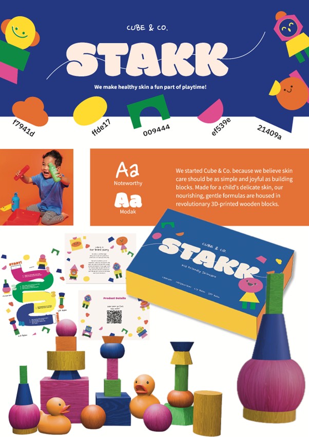
Mariam Hazaa
This project was for “STAKK”, a line of kid-friendly skincare by Cube & Co. I worked with their brand story, which centers on the belief that skincare for delicate skin should be as simple and joyful as building blocks. The products are nourishing, gentle formulas housed in revolutionary 3D-printed wooden blocks. I also captured key elements like their brand promise, "We make healthy skin a fun part of playtime!" and their primary color palette.
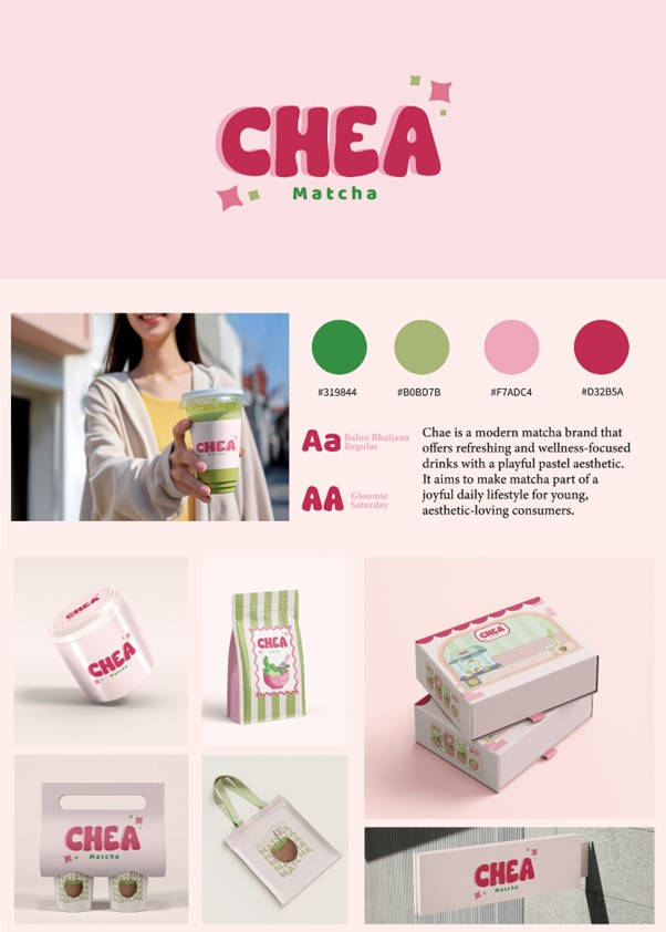
Shaden Hamad
In this project, I created a complete brand kit for “CHEA Matcha”, built around soft pastel colors and a playful, youthful logo. The visual identity reflects the idea of matcha as a joyful, everyday treat clean, friendly, and full of positive energy. The brand kit includes the logo, color palette, typography, and various packaging applications such as cups, boxes, tote bags, and labels. The goal was to create a cohesive and immediately recognizable identity that gives the brand a clear personality and appeals to consumers who love modern, aesthetic-driven design.
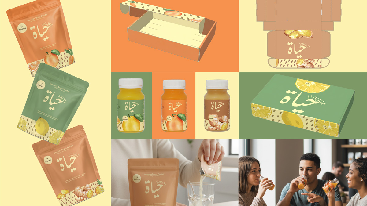
Layal Khawajah
In this project, I curated the design of “Hayat” to reflect a warm, natural, and uplifting visual identity inspired by wellness and vitality. Soft earthy tones blended with fresh citrus colors create an inviting palette that expresses energy, while the Arabic logotype introduces cultural authenticity and emotional familiarity. Hand-drawn fruit illustrations and organic shapes further highlight the brand’s natural ingredients and purity.