Design Series
Brand in Focus: Crafting Cohesive Product Collections
In this project, students developed cohesive product collections that convey a unified brand story. The process guides them through every stage of brand development—from defining core identity and target audience to designing products, packaging, and visual systems that connect emotionally with users. Emphasis is placed on strategy, consistency, and storytelling, enabling students to create a full product line that is visually and conceptually harmonious while resonating with its intended audience.
Layal Khawajah
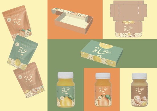
The “Hayat” product line features three natural 60 ml immunity shots, each formulated for a different health benefit. Ginger & Lemon supports digestion and immunity, Turmeric & Honey targets inflammation and vitality, and Black Seed & Mint aids respiratory health and energy. Each variant has its own ingredient-inspired color and illustration, while sharing Hayat’s cohesive visual style, warm earthy tones, organic shapes, and soft typography, creating a clear family of products with distinct functions.
Shaden Hamad
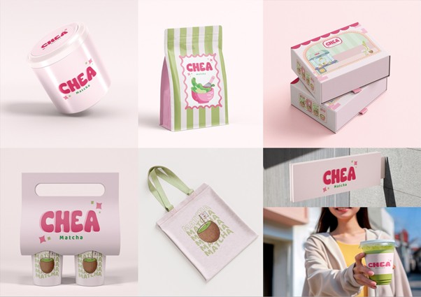
The “CHEA Matcha” brand presents a playful and modern identity built around soft pastel colors and a youthful visual language. Each packaging item ranging from tins and pouches to boxes, tote bags, and cup carriers expresses the brand’s cheerful personality through rounded typography, cute illustrations, and a fresh pink-and-green palette inspired by matcha. While every product has its own layout and graphic accent, they all share the same cohesive style: clean shapes, warm highlights, and a friendly hand-drawn aesthetic. Together, these elements create a unified brand family that feels fun, approachable, and instantly recognizable, reflecting matcha as a joyful everyday treat.
Reem Chaaban
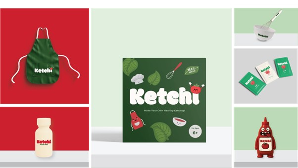
This project taught me how to build a cohesive brand by keeping every product, color, and visual element connected to one clear identity. I learned the importance of consistency, audience-focused design, and storytelling across a full product line. Creating the “Ketchi” items helped me understand how a brand becomes an experience, not just a logo, and how thoughtful design can make a product feel fun, engaging, and memorable.
Kenan Harb
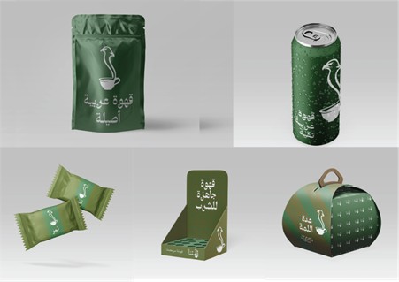
“Lamitna” is a coffee brand focused on the future of hospitality, and how we want everything to be ready to go, and easy to use. A simple design, that conveys a deeper meaning, would make it feel closer to us, a brand that will truly represent the future of what coffee is all about.