Textures and Letters
Textured Typography: Giving Form Depth and Meaning
This project investigates how texture can enhance both the visual and emotional impact of design. Using the Figure and Ground principle, students transform the first letter of a chosen theme—such as Art, Nature, or Technology—into a meaningful composition. The process involves creating texture studies, developing layered compositions that suggest touch and depth, and producing a final inked design. By combining concept, craftsmanship, and creativity, the project communicates a theme through both form and tactile visual expression, turning a single letter into a rich and engaging design statement.
Maryam Rashid
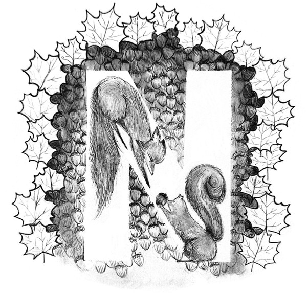
This project explores story-telling through textures and patterns. My story was about a fox and a squirrel creating a friendship pact, and the design was meant to have a warm autumn aesthetic. I picked “N” for nature, encompassing a little fluffy squirrel and an equally fluffy fox; with an acorn texture in the background, framed by a pattern of maple leaves. The mediums I used were grey and black fineliners, white ink and alcohol markers.
Mais Nafisa
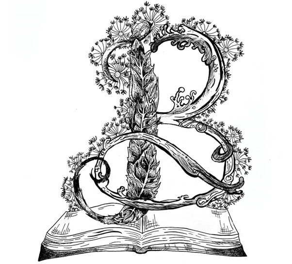
This project explores different textures and incorporates them to a letter design. This is designed to give a feel of a story I wrote for this project which talked about a boy who found an antique book in a store and when he opened it it showed him childhood memories: these memories were all nature related ones of running through dandelion fields, a park he used to play in, and a tree that stood in his garden. The “B” represents one of the main elements of my story—the book— surrounding it are the textures found in my story. The Project was made using pens and digital scanning and editing tools.
Habiba Hafez
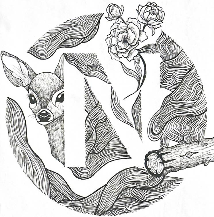
My idea connects strongly to nature, which is what the “N” stands for. The shapes and lines in my work are inspired by natural forms, such as leaves, branches, and organic patterns. I wanted to reflect the flow, balance, and movement found in the natural world, using these elements to give the artwork a sense of life and peace.
The process relied mainly on pen techniques such as hatching, cross-hatching, stippling, and controlled line work. I built up the lines slowly to create depth and contrast, changing pressure and direction to achieve different effects.
Anjali Nair
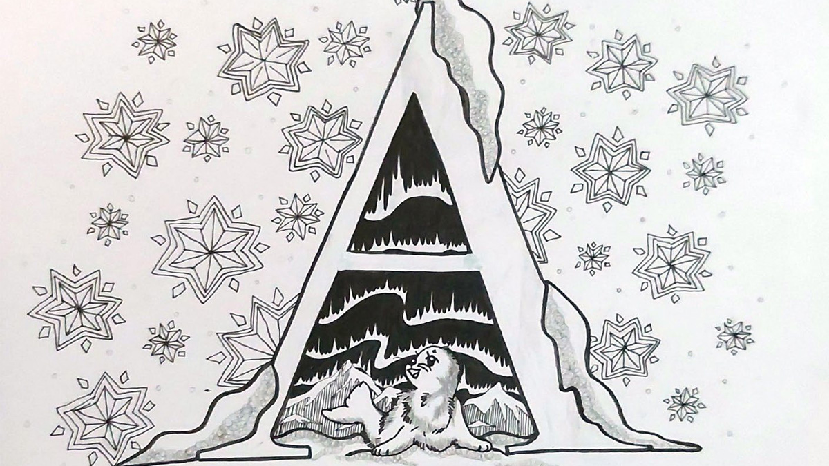
This assignment was challenging but also well rewarding. The letters with textures fit the theme of the drawing was animals which is why I used the letter “A” as the letter. The story is of a baby seal that sneaks out to see the northern lights. The drawing includes winter elements such as snowflakes and mountains while also including the seal and northern lights. The drawing was made using mainly black fine liners for the outline and a little bit of grey fine liners were used to add shading and depth to the drawing.