II: AMG Typography and Design

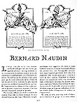
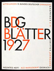
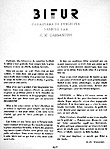
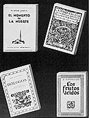
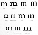
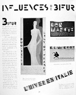
The typographic layout of Arts et Métiers Graphiques can be considered as the most pervasive theme of the magazine. Like perpetual advertising, each issue was almost entirely hand-set with Deberny et Peignot typefaces that changed with the trends of the time. In 1927, AMG was first set in "Naudin," a traditional serif typeface with long ascenders from the Deberny and Peignot catalogue. As the content became more progressive, sans serifs gradually appeared, espQecially "Europe," which was Bauer's "Futura" with a Deberny et Peignot name. Also, when Cassandre's "Bifur" was introduced in 1928, it became an instant signature display typeface for advertisements and articles that needed an ultra-modernistic look. In accordance with the 1937 Exposition, which deemed "Peignot" as the official typeface of the event, AMG 59 was set entirely in the same uncial-inspired face (figs. 61-64).

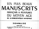
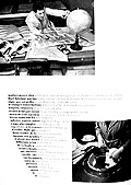
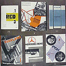
Just as the typeface choices were novel, so too were the text layouts that employed those faces. The layouts, again showcases of what was possible with Deberny et Peignot type, commonly mimicked the individual article themes with inventive typesetting in illustrative shapes or patterns. Aligned with the foundry's mission to sell type, the creative design of AMG needed to be at the vanguard in order to serve Peignot's ambition of creating a magazine that aspired to be the reference in the graphic arts. Evidence of this is shown in the fact that the magazine's colophon was placed at the front of the issue for all to see, instead as an afterthought squeezed into fine print at the end (figs. 65-67).

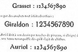
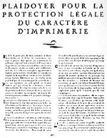
Along with elegant typesetting and design, the magazine frequently published articles that discussed type from different perspectives. Type history, type designers, type classification, and type design aesthetics were subjects all broached in Arts et Métiers Graphiques. Startling too is the forethought of Charles Peignot as he published several articles on the copyright protection of typefaces—a topic that has become equally poignant at present with the digital production and easy-replication of typefaces (figs. 68-73).

Figures

Fig. 61: Typography example. From: M. Heine, "Bernard Naudin," AMG Paris 5 (20 November 1928), 272.
Fig. 61: Typography example. From: M. Heine, "Bernard Naudin," AMG Paris 5 (20 November 1928), 272.
Fig. 62: Typography example. From: B. Guégan, "Le ‘Futura,’" AMG Paris 6 (1 July 1928), 388b.
Fig. 62: Typography example. From: B. Guégan, "Le ‘Futura,’" AMG Paris 6 (1 July 1928), 388b.
Fig. 63: Typography example. From: A.-M. Cassandre, "Bifur: Caractère de Publicité..." AMG Paris 9 (15 January 1929), 578.
Fig. 63: Typography example. From: A.-M. Cassandre, "Bifur: Caractère de Publicité..." AMG Paris 9 (15 January 1929), 578.
Fig. 64: Typography example. From: "Sommaire," Les Plus Beaux Manuscrits... 60 (1 November 1937), 3.
Fig. 64: Typography example. From: "Sommaire," Les Plus Beaux Manuscrits... 60 (1 November 1937), 3.
Fig 65: Layout and typography. From: "Actualité Graphique," AMG Paris 20 (15 November 1930), 105.
Fig 65: Layout and typography. From: "Actualité Graphique," AMG Paris 20 (15 November 1930), 105.
Fig. 66: Layout and typography. From: L. Chéronnet, "Publicité pour la Fumée," AMG Paris 34 (15 March 1933), 26.
Fig. 66: Layout and typography. From: L. Chéronnet, "Publicité pour la Fumée," AMG Paris 34 (15 March 1933), 26.
Fig. 67: Layout and typography example. From: L. Chéronnet, "Création des Mondes," AMG 50 (15 December 1935), 17.
Fig. 67: Layout and typography example. From: L. Chéronnet, "Création des Mondes," AMG 50 (15 December 1935), 17.
Fig. 68: Article about typography. From: J. Cassou, "Notes sur la Typographie en Espagne," AMG Paris 8 (1 November 1928), 479.
Fig. 68: Article about typography. From: J. Cassou, "Notes sur la Typographie en Espagne," AMG Paris 8 (1 November 1928), 479.
Fig 69: Article about typography. From: F. Thibadeau, "Classification de Caractères d’Imprimerie...," AMG Paris 13 (15 September 1929), 790.
Fig 69: Article about typography. From: F. Thibadeau, "Classification de Caractères d’Imprimerie...," AMG Paris 13 (15 September 1929), 790.
Fig. 70: Article about typography. From: J. Tschichold, "Qu’est-ce que la Nouvelle Typographie et Que Veut-Elle?," AMG Paris 19 (15 September 1930), 46.
Fig. 70: Article about typography. From: J. Tschichold, "Qu’est-ce que la Nouvelle Typographie et Que Veut-Elle?," AMG Paris 19 (15 September 1930), 46.
Fig. 71: Article about typography. From: M. Vox, "Esquisse d’une Théorie du Chiffre," AMG Paris 25 (15 September 1931), 379.
Fig. 71: Article about typography. From: M. Vox, "Esquisse d’une Théorie du Chiffre," AMG Paris 25 (15 September 1931), 379.
Fig. 72: Article on typeface copyright protection. From: C. Peignot, "Plaidoyer pour la Protection Légale de la Caratère d’Imprimerie," AMG Paris 17 (15 May 1930), 976.
Fig. 72: Article on typeface copyright protection. From: C. Peignot, "Plaidoyer pour la Protection Légale de la Caratère d’Imprimerie," AMG Paris 17 (15 May 1930), 976.
Fig. 73: Article on typeface copyright protection. From: M. Vox, "Influences de Bifur," AMG Paris 19 (15 September 1930), 32.
Fig. 73: Article on typeface copyright protection. From: M. Vox, "Influences de Bifur," AMG Paris 19 (15 September 1930), 32.