VI: Deberny et Peignot, Post-War
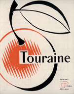
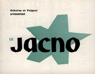
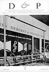
Paris was liberated on August 25, 1944. Official Allied victory in Europe was announced on May 8, 1945 when the German forces finally surrendered.[58] Deberny et Peignot's first post-war creation was 1947's "Touraine," a face revamped by Cassandre as a version of "Peignot" with traditional lower-case characters. The thick lineal typeface, "Jacno," named after its designer, was introduced in 1950. The lofty ideals asserted in Arts et Métiers Graphiques did not resurface after the War. Instead of producing luxury publications, the foundry opted for editorial work geared towards self-promotion—undoubtedly to aid in financial recovery. The first issue of D & P: Bulletin Périodique de Liason et de Documentation appeared in February 1951. It was a small booklet aimed at "the need for us [D & P] to maintain more frequent and direct contact with our friends and clients."[59] The publication provided a quarterly note from Charles Peignot, a question and answer column for printers, an industry news column, and many advertisements of Deberny et Peignot types, services, and machinery (figs. 25-27).
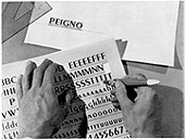
By the 1950s, Deberny et Peignot had somewhat recovered and was again on track to resume its post as a typographic giant. Charles Peignot had become general director and president, and it was his sole decisions that guided the firm's direction. In 1952, he seized upon the opportunity to partner with the American-based Photon, Inc. This company had patented the 1944 invention of two French engineers, Louis Moyroud and René Higonnet, who made the first photographic type compositor. The Photon combined the technologies of a typewriter key-based entry system, a telephone relay system, and a photographic unit. Letters could be keyed in by an operator and simultaneously stored by binary impulse in a computer memory bank. On command, the impulse-stored letters would call up the correct position on a glass disc that contained the outlines of 1400 characters of a typeface in different fonts. Once the revolving disc was positioned to the correct letter, a strobe light would expose the letter outline onto film. Since the exposure only lasted for microseconds, eight characters could be written to film per second (figs. 28, 29).[60]
Peignot later said that his eagerness to promote photo-composition was partly due to the fact that his father had missed the chance to profit from mechanical typesetting earlier in the century. Apparently, Georges Peignot was repelled by the inferior quality of machine-set type in the pre-1914 era. Also, the elder Peignot was not forced to adopt the new technology because he was financially comfortable from his success with popular typefaces like "Cochin."[61] Optimistic for Photon's prospects, Charles Peignot first presented the machine, under its commercial name, Lumitype, in Paris in 1954. In retrospect, the concept was revolutionary for the printing industry, but the Lumitype itself did not succeed. One of its early foibles was that accented character sets, present in French and other European languages, were initially ignored on the type discs in order to enable speedier exposure times.[62] In spite of this, Deberny et Peignot still launched a product line for Lumitype typesetting.
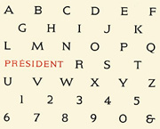
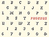
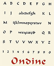
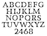
Concurrent to the Lumitype venture, Peignot cultivated the talents of a young Swiss designer who would become a prolific contributor to modern typography. In 1952 Peignot Spotted the college portfolio of Adrien Frutiger (b. 1928), was leading him to offer a job to Frutiger in Paris. As a Deberny et Peignot employee, Frutiger rapidly turned out three faces that he later considered as only "practice work:" "Président" and "Phoebus" in 1953, and "Ondine" in 1954. As Frutiger supervised the conversion of classic typefaces such as "Garamont," "Baskerville," and "Bodoni" over to the format of the Lumitype matrix discs, he also drew his first mature typeface, "Méridien" that was released in 1955 (figs. 30-33).[63]
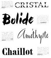
Deberny et Peignot also introduced an inline titling face called "Cristal" in 1955. It was designed by Peignot's son, Rémy, and was important because it became part of the first set of typefaces printed on a dry transfer paper called Typophane.[64] The adhesive-backed translucent sheets were marketed in 1957 as the superior alternative to hand-drafting letters in a layout. In addition to "Cristal," Jacno's "Chaillot" and Georges Vial's "Bolide" and " Améthyste" types were issued in the introductory Typophane set (figs. 34-36).[65]
"Univers" is the Deberny et Peignot type that exploded in world markets in 1957. Frutiger originally conceived the design as a student in Zurich. When Peignot was considering the addition of a sans serif to the Lumitype collection, Frutiger lobbied to put Univers into development in place of Europe. "Univers" subsequently became the first typeface to be manufactured simultaneously as hand-set type, Monotype mechanical type, and photo type—bridging all the technological methods developed over the previous four centuries of typesetting.[66]
Peignot once stated:
"'Univers' is not exactly my favorite. It was an excellent treatment of an existing theme, but not really a creation in the true sense of the word; but I knew it was a good character for the times and that it would be very successful. It was for me a commercial venture. In fact it is with 'Univers' that French typography regained its position in the international market."[67]
Regardless of Peignot's tastes, the overwhelming appeal of "Univers" was its humanity in spite of its geometricity. The letterforms were stripped down to unadorned lines and curves, but they were proportioned with subtle variations that were created only by hand—not by wielding the T-square and compass. Frutiger also recalled that he was liberated by the photosetting process:
"Because photosetting has much more economical methods of typeface production than metal setting; the styles of a typeface family could be freed from the century-old triptych of Roman/Bold/Italic in favour of a complete and consistently structured range comprising a multitude of styles."[68]
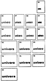
Open to these possibilities, Frutiger designed twenty-one "Univers" width and weight variations complete with an innovative numbering system that identified their characteristics. The system tried to dispense with ambiguous typeface names such as "Univers heavy" v. "Univers bold," but companies such as Monotype still marketed it with the traditional naming conventions (fig. 37).[69]
Frutiger's last Deberny et Peignot type was "Egyptienne" in 1960. The success of "Univers," afforded him many opportunities outside of the foundry. He went on to establish his own studio and attract lucrative commissions including the signage package for the Charles De Gaulle international airport in Paris.[70]
"Univers" was not Charles Peignot's last successful endeavor. In the the 1950s and 60s he increasingly positioned himself as an unofficial ambassador of typography. A preview of this behavior was seen in his return of the original "Baskerville" punches to Cambridge University on March 12, 1953.[71] At approximately the same time, Peignot began to call together his friends and colleagues to discuss issues that impacted the typography industry. This group, a veritable pantheon of leaders in the field, eventually included Maxmilien Vox, John Dreyfus, Hermann Zapf, Roger Excoffon, Frutiger, and many others. In 1957, their purpose was formalized under the title of the Association Typographique Internationale, (ATypI), with Peignot as the organization's first and standing president through the 1960s.[72]
Foremost on Peignot's ATypI agenda was the fight against illegal copying of type designs—all of which were not protected under copyright law. He once stated: "I created ATypI as a place where artists and industries could regroup to fight against the copy. If artists are not protected like authors and creators are in other domains, they will renounce typographic creation."[73] This crusade met with minimal success. ATypI drafted a type protection treaty for presentation at an international conference in Vienna in 1973. The delegates from the eleven countries present signed the agreement, but the actual document has yet to be officially ratified by any of those countries' governments.[74] Protective legislation for copyrighting type designs was typically (and presently) hindered by the argument fought over how something as universal as the alphabet can be copyrighted for private or licensed use.
Despite this setback, ATypI concurrently worked to group typeface designs into a standardized classification method for use in the Western world. After deliberation, the ATypI commission chose a system in the late 1950s that Maximilien Vox had devised through his work as editor of the Deberny et Peignot general type specimen in the 1930s.[75] The ATypI-Vox classification organizes typefaces by their design characteristics into ten distinct groups for the benefit of easy typeface recognition and specification. (See Appendix C: "ATypI-Vox Typeface Classification System.")
Charles Peignot retired as president of ATypI in 1973, but even in his absence, the organization has prospered. Today it touts a world-wide membership of designers, typographers, foundries, writers, publishers, printers, software companies, and representatives from industries that are united through interests in typography. Following Peignot's lead, the association continues to promote the ethical usage of type through legislation. It has also expanded its goals to encompass the preservation of typographical history and tradition, the advancement of quality design education, and the development of outstanding digital typefaces. ATypI now hosts an annual conference that culminates with the presentation of the "Prix Charles Peignot" to a pivotal contributor to the world of type design.[76]
Peignot retired from his position at Deberny et Peignot in the early 1960s. In 1972 his family business was bought by the Swiss Haas'sche typefoundry-absorbed like so many others at the hands of Peignot's own predecessors. Haas incidentally, was one of the oldest surviving foundries, with traces to printing extending back as far as 1579 in Basle.[77] Haas again exerted its dominance in the French market with the 1978 acquisition of Fonderie Olive, which, since 1836, had been a Marsellaise competitor to Deberny et Peignot. Haas fell to company consolidation when Linotype purchased it in 1989 and discontinued its foundry division. Haas's type designs, along with those of Deberny et Peignot, Olive, and a litany of conquered companies, are now distributed through the Linotype Library GmbH and its affiliated licensees, including Adobe, Inc. in the United States.[78] Of course, those designs do not exist today in large quantities as the tangible metal objects that they were when acquired.* Typefaces like Peignot and Auriol have since been reinterpreted into the vectors and hinting commands of digital type. (*Note 9/2010 & 6/2020: The Schriftenservice D. Stempel GmbH now owned many matrices for D & P types including noted designs like Bifur, Scribe, and Univers. Schriftgießerei Rainer Gerstenberg now holds this collection. Modern letterpress printers may purchase by weight newly cast hot metal type of many classic designs.)
Charles Peignot was not present to see bytes replace pieces of molded lead alloy. He died in 1983 at the age of 86. He did live long enough, however, to witness the mechanization of a 400 year-old industry, the modernization of aesthetic ideals, and the synthesis of the goals of his peers. Peignot's story is remarkable not only for the fact that he witnessed all of these events, but for the reality that he was a driving force that shaped them.
Figures
Appendix
Thesis: https://scholarworks.rit.edu/theses/626/
Page Notes
58 The History Place; World War Two in Europe Timeline. <http://www.historyplace.com/worldwar2/timeline/ww2time.htm>, 4 October 2000.
59 D & P: Bulletin Périodique de Liason et de Documentation, Fonderies Deberny et Peignot, No. 1, Février, 1951.
60 Geoffrey Ashall Glaister, An Encyclopedia of the Book (New York: World Publishing Company, 1960), 314.
61 "Deberny et Peignot: La Belle Époque de la Typographie," 43.
62 "Deberny et Peignot: La Belle Époque de la Typographie," 51.
63 Carter, 165.
64 Carter, 163.
65 Typophane, Deberny et Peignot brochure, ca. 1957.
66 Carter, 165.
67 Heller, 65.
68 "Linotype Library: Frutiger Traces Univers," Linotype Library GmbH, 6 June 2000: <http://www.linotypelibrary.com/lounge/loung_feat_frut_4univers.html>, 5 October 2000.
69 Carter, 167.
70 Carter, 167.
71 Bulletin d'Information DP no. 9 (Paris: Presses Deberny et Peignot, April 1953).
72 Ponot, 85.
73 "Deberny et Peignot: La Belle Époque de la Typographie," 53.
74 Heller, 66.
75 Ponot, 87.
76 "About ATypI," Association Typographique International, 16 March 2000: <http://www.atypi.org/visitors/tour/tour.html>, 4 October 2000.
77 Eason et al., 83.
78 "Linotype Library: A Company with a (Very) Long History," Linotype Library GmbH, 1999: <http://www.fordesigners.com/xheight/linotype.cfm>, 26 September 2000.