IV: Deberny et Peignot, 1924-1938
After finalization of the merger, Charles began to assume authority in acting upon his own artistic convictions in typeface design. Even though the foundry's recuttings of classic types were popular, he once said, "The [type] revivals were not bad. But, because they were so humdrum, they led me to try a different approach."[26] His first project in this vain was the 1924 typeface, "Sphinx," a heavy Egyptian face with blunt serifs and high contrast between the characters' thick and thin strokes. "Sphinx's" quasi-geometric qualities were a reaction against the curvilinear forms of Art Nouveau faces like "Auriol" (fig. 15).
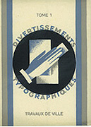
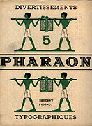
In 1924, Peignot also began to collaborate with Maximilien Vox, (nee Samuel Monod, 1894-1974), typographer, art director, and critic. This would be an association that would last for eight years, profoundly influencing the direction of French typography. Peignot entertained the notion of creating a publication that would showcase the riches of the newly-joined foundry. Vox's work as art director for the publishing houses of Librarie Plon and Horizons de France appealed to Peignot's tastes. He approached Vox with an offer in which Vox later said he could "realize the totality of my typographic conceptions."[27] The later result of his work would be the specimen/magazine Les Divertissements Typographiques where the Deberny et Peignot types appeared in novel layouts for clients' inspiration.[28]
Charles Peignot's artistic beliefs were legitimized into a bona fide genre at the 1925 Exposition des Arts Décoratifs et Industriels Modernes. At this fair for commercial products, the Art Deco style was formally introduced to the world from Paris. Deco's inspirational roots stemmed from diverse sources. These included Picasso and Braque's cubism that had first shocked the world in 1907; the exoticism of Egyptian and Native American motifs, rediscovered in Tutankhamen's tomb in 1922 and in newly-excavated Mayan temples; the quasi-constructivist stage and costume design of Les Ballets Russes that had toured Paris before World War I.[29] Contrastingly, the organic forms, floriated masses, and snaking tendrils of Art Nouveau had become so Baroquely profuse that the pure beauty of the original style was choked. Art Deco replaced these eccentricities with new symbols of power and progression: the lightning bolt and the chevron.[30] Rectilinear motifs could be seen in all things at the Expo—buildings, furniture, packaging, advertisements.
The environment was fertile for this change in sentiment. The style represented a new mode of prosperity and normality that was attractive to the French who were recovering from war. Deco's favorable connotations stimulated the consumption of goods that were wrapped with its motifs. As such, the great department stores of Paris used Deco to advertise products and lure customers. The Art Deco design trend spread to many consumable items—not the least of which was Art Deco type.[31]
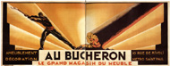
Charles Peignot made connections with the key participants in the Deco and Modernist movements around the time of the Exposition. A.-M. Cassandre, (nee Adolphe Jean-Marie Mouron, 1901-1968), won first prize at the Expo for a furniture store's poster design entitled "Au Bûcheron."[32] The design is activated by an orange-gold background sliced into diagonals created by the forms of a lumberjack swinging an axe on the left and a tree falling on the right. Cassandre's hand-drawn type may have impressed Peignot, as each letter is stylistically reduced to its geometric essence, devoid of any curves other than compass-drawn circles. From this introduction, Peignot commissioned Cassandre to design letters for the foundry (fig. 16).
Cassandre moved among the circles of the 1920s Parisian Avant-Garde which included the symbolist composer Eric Satie (1866-1925), the absurdist writer Apollinaire (1880-1918), and the cubist painter Fernand Léger (1881-1955).[33] Following the Art Deco premiere at the 1925 Exposition, Cassandre joined with designer Jean Carlu (1900-1997) to form a group of artists whose mission would be to advance Modernist aesthetics in all applications of design and thought. The Union des Artistes Modernes (UAM) was born of this common goal. Charles Peignot, joined the group's membership with the likes of writer Jean Cocteau (1887-1963), Nobel laureate André Gide (1869-1951), architect Le Courbusier (1887-1965), decorator Sonia Delaunay (1885-1979), Maxmilien Vox, and other artists who specialized in the design of jewelry, textiles, furniture, and lighting.[34] Peignot later clarified the group's purpose: "Together we tried to break away from the style that survived the first World War. It is not surprising that I tried to accomplish in my field what my friends were doing in theirs."[35] With a supportive peer group, a willing audience, a rejuvenated economy, and the fine reputation of his firm, Charles Peignot was set to become a leader in his field.
The year 1926 erupted with the initial production of Les Divertissements Typographiques. Peignot served as editor, and Vox as designer. The first issue in this series, that was given freely to printers, was published in Autumn 1928.[36] In 1926, Peignot also set up a side-business called "Le Service Typographique" that complimented the foundry. He intended it to be a publicity studio where the design innovations presented in Divertissements could be put to commercial practice with Deberny and Peignot typefaces (fig. 17).[37]
In 1927, Peignot launched the first edition of Arts et Métiers Graphiques, a magazine that would become a world forum for trends in the graphic arts. AMG was a personal undertaking for Peignot as he stated, "The foundry never aided in the financing of the magazine that held an equilibrium like an incessant gymnast."[38] Peignot's goal was to print "the most interesting and luxurious [magazine of art] in the world."[39] He did so by assembling a noteworthy staff that reported on subjects ranging from the history of writing, to photography, to Picasso's latest canvases. The magazine was a fixture of fine printing and journalism for twelve years until the onset World War II prevented its production.
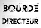
Nineteen twenty-nine ushered in two triumphs for Deberny et Peignot. First, Charles Peignot bought the rights to a Bauhaus sans serif typeface called "Futura" that was originally designed by Paul Renner for the German foundry, Bauer. Maximilien Vox recognized "Futura's" potential as a best-seller and urged Peignot to acquire it. The typeface was marketed in 1930 by Deberny et Peignot under its commercial name, "Europe." Les Divertissements Typographiques debuted the typeface in Spring 1931.[40] Although Europe was not one of Peignot's favorites, in 1929 he also issued a typeface that suited his tastes—"Bifur," designed by Cassandre. "Bifur" is a typeface that escapes rigid classification, but perfectly embodies the Art Deco spirit. Unlike the simplistic purity of line in Europe, "Bifur" broke letterforms into busy geometric line and block patterns in upper-case characters that colored a page with an active border at first glance, and then shouted out the heading message upon closer examination.[41] Peignot later recounted "Bifur's" impact:
"There were no new or innovative typefaces which existed at the time. The 'Bifur' created a real scandal . . . at least in the small world of publishing and printing. Engraving this design was a remarkable tour de force. Needless to say, 'Bifur' was not a financial success, but in those happy days one could afford to take a few risks." (figs. 18, 19).[42]
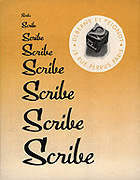
Those "happy days" characterized the foundry's achievements in the beginning of the 1930s. In 1930, Deberny et Peignot released another Deco typeface by Cassandre progressively named "Acier," or "Steel", which was the matierial of choice for UAM furniture designers and architects.[43] Peignot continued to publish Les Divertissements Typographiques on a quarterly basis through the first half of the decade. His pet project, Arts et Métiers Graphiques, eked out an international name for itself as a luxury brand. In the early 30s, Peignot and his editorial team spear-headed the concept of yearly AMG special editions that focused on Photography and Publicity—hot topics in the graphic arts.[44] Showing no indications of a business slump, the foundry's Spécimen Général for 1935 was a monstrous two-volume work that sold proofing presses and tools in one volume and countless pages of foundry type in the other.[45] New typefaces by graphic designer Marcel Jacno (1904-1989) appeared in the 1930s: "Film," a three-dimensional face in 1934, and the 1937 script called "Scribe" (figs. 20-23).[46]
However prosperous the giant Deberny et Peignot was, an economic depression stifled the world during the 1930s. By 1931, France was experiencing the aftershocks of the crash that had first toppled the United States' economy in 1929. Between 1929 and 1938, French exports fell 50%, as the country's goods were over-priced in the world market.[47] Exports of fashionable French luxury items suffered the most and predictably publication of Arts et Métiers Graphiques was impacted. From 1936 until 1939, the magazine only appeared five times per year reduced from six issues because of prohibitive paper costs.[48]
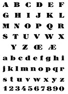
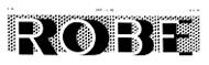
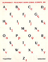
Paris's last world's fair, the Exposition Internationale des Arts et Techniques dans la Vie Moderne, was held in May 1937. Apart from being a venue for examples of international innovation, the French organizers hoped that the Exposition would promote the country's economic recovery and provide jobs for the unemployed.[49] From the arts perspective, this event was a triumph for the Union des Artistes Modernes (UAM) as the majority of the Expo's building commissions went to UAM architects and designers.[50] With UAM allies at the helm, it was no surprise that a Deberny et Peignot type would become the official face for the Exposition signage. Cassandre's typeface, "Peignot," debuted on February 12, 1937.[51] It aspired to return to the purity of the original Roman letters, while abandoning "the cursive handwritten lower-case forms which the printing trade inherited from the fifteenth-century humanists."[52] The resulting typeface ignored the traditional designs of many miniscule letters and instead replaced them with scaled-down versions of their capitalized variations. In the 1937 specimen, "Peignot" is heralded as a new inscriptional type that dispensed with the "confused mass of calligraphical curves and dots" of the lower-case.[53] As such a novel and supremely French approach to character design,"Peignot" was seen everywhere at the Exposition, most notably on the edifice of France's Palais de Chaillot museum that stands today (fig. 24).[54]
Figures

Page Notes
26 Heller, 62.
27 René Ponot, "Maximilen Vox, Le typographe," Maximilien Vox: Un Homme de Lettre (Paris: Agence Culturelle de Paris, 1994), 64.
28 Ponot, 65.
29 Bevis Hillier and Stephen Escritt, Art Deco Style (London: Phaidon Press, Ltd., 1997).
30 Stephen Heller and Louise Fili, French Modern: Art Deco Graphic Design (San Francisco: Chronicle Books, 1997), 12.
31 Heller and Fili, 8.
32 Henri Mouron, Michael Taylor, translator, A. M. Cassandre (New York: Rizzoli International Publications, Inc., 1985), 305.
33 Hillier and Escritt, 230.
34 Hillier and Escritt, 123.
35 Heller, 62.
36 Ponot, 65.
37 Helene Dufour, "Arts et Métiers Graphiques 1927-1939," Arts et Métiers du Livre 188 (November-December 1994), 4.
38 "Deberny et Peignot: La Belle Époque de la Typographie," 49.
39 Dufour, 3.
40 Ponot, 65.
41 Hillier and Escritt, 122.
42 Heller, 64.
43 Mouron, 314.
44 Françoise Denoyelle, "Arts et Métiers Graphiques: Histoires d'Images d'une Revue de Caractères," La Recherche Photographique (Paris: Paris Audiovisuel: Presses universitaires de Vincennes, Decembre, 1987), 7.
45 Spécimen Général des Fonderies Deberny et Peignot (Paris: Fonderies Deberny et Peignot, 1935), vols. I, II.
46 Jaspert, Berry, and Johnson. The Encyclopaedia of Typefaces (London: Blandforn Press, Ltd., 1991), 273, 397.
47 Hillier and Escritt, 127.
48 Dufour, 6.
49 Arthur Chandler, "Confrontation: The Exposition Internationale des Arts et Techniques dans la Vie Moderne," World's Fair Magazine, vol. 8, no 1. 1988. Revised January 2000: 43 pars <http://charon.sfsu.edu/PARISEXPOSITIONS/1937EXPO.html>, 4 October 2000.
50 Hillier and Escritt, 130.
51 Mouron, 94.
52 Le Peignot Caractère dessiné par A. M. Cassandre (Paris: Deberny et Peignot, 1937), brochure.
53 Le Peignot Caractère dessiné par A. M. Cassandre (Paris: Deberny et Peignot, 1937), brochure.
54 "Deberny et Peignot: La Belle Époque de la Typographie," 45.