Colors
Our Color Palette
Beyond our logo, color is one of the most recognizable aspects of our brand identity. Using color appropriately is one of the easiest ways to make sure our materials reflect a cohesive RIT brand.
Rule of Thumb
A robust color palette provides many design options, but we must exercise thoughtful consideration and restraint to make sure we don’t lose our visual identity.
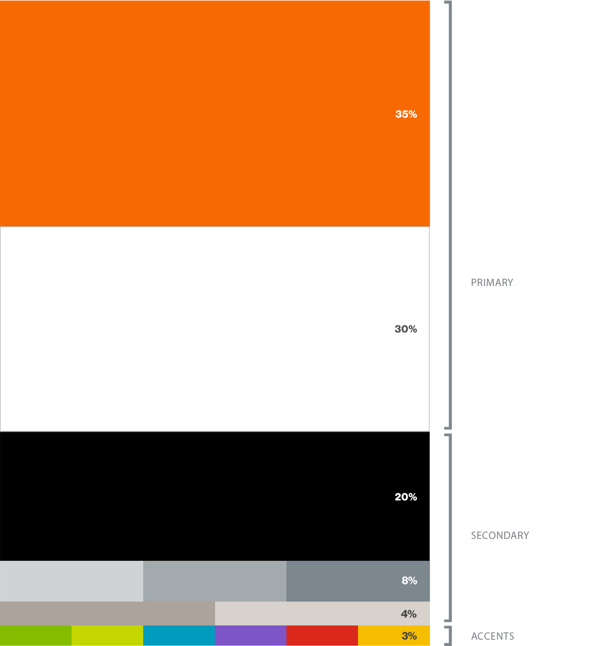
Here is a general guide for making effective choices as you use color in compositions. This isn’t meant to imply a strict mathematical distribution of the colors on the page; rather, these ratios should help your layout pass a squint test.
Primary Palette
Our primary palette consists of RIT orange, and white. Our layouts lean heavily on these colors, mixing in the neutral and accent palettes to build color schemes that are complementary and balanced.
Pantone
1505 C
CMYK*0 68 100 0 RGB*247 105 2 HEX#F76902
White
CMYK00 00 00 00 RGB255 255 255 HEX#FFFFFF
* RIT orange is PMS 1505c. The other values for orange shown here, such as RGB and CMYK, have been interpreted for RIT use. Do not use the Pantone-recommended values for 1505c.
Secondary Palette
These neutral hues pair perfectly with the primary palette. Due to the subdued nature of these colors, overpowering the primary set is less of a concern.
Use these as supplementary colors rather than driving colors in layout and materials.
Black
CMYK0 0 0 100 RGB00 00 00 HEX#000000 Rich Black40 40 40 100
PMS
427C
CMYK7 3 5 8 RGB208 211 212 HEX#D0D3D4 CMYK Uncoated15 7 10 4
PMS
429C
CMYK21 11 9 23 RGB162 170 173 HEX#A2AAAD CMYK Uncoated38 22 22 4
PMS
430C
CMYK33 18 13 40 RGB124 135 142 HEX#7C878E CMYK Uncoated47 31 29 4
PMS
Warm Gray 1 C
CMYK3 3 6 7 RGB215 210 203 HEX#D7D2CB CMYK Uncoated2 3 7 8
PMS
Warm Gray 5C
CMYK11 13 16 32 RGB172 163 154 HEX#ACA39A CMYK Uncoated10 12 13 28
Accents Palette
Although our primary and secondary palettes should drive most materials, in certain instances, other colors need to be used. For those circumstances, we have developed this accents palette. Do not use these colors for full-color bleeds. They should be used occasionally and sparingly.
Under no circumstances should any of them become the predominant color for a school, center, institute, or department.
PMS
376C
CMYK 54 0 100 0 RGB 132 189 0 HEX#84BD00
PMS
382C
CMYK28 0 100 0 RGB196 214 0 HEX#C4D600
PMS
7703C
CMYK79 2 10 11 RGB0 156 189 HEX#009CBD
PMS
2665C
CMYK70 76 0 0 RGB125 85 199 HEX#7D55C7
PMS
485C
CMYK0 95 100 0 RGB218 41 28 HEX#DA291C
PMS
7408C
CMYK0 29 100 0 RGB246 190 0 HEX#F6BE00