Color scientists explain the dress that went viral
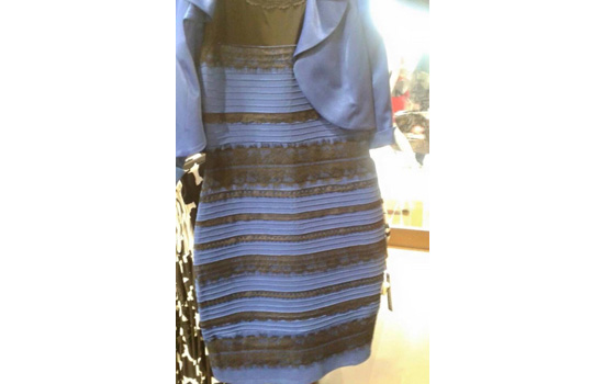
The dress, seen in a photo from Caitlin McNeill's Tumblr site.
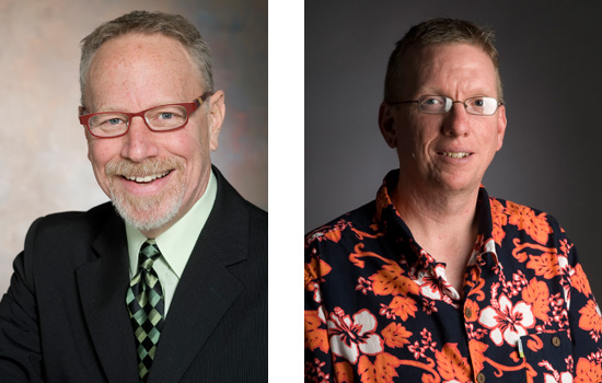
Rochester Institute of Technology color scientists know why the color of the dress that went viral has some people seeing blue/black and other seeing white/gold.
“An aspect of color perception is interpreting the color and intensity of the illumination,” said Roy Berns, R. S. Hunter Professor in Color Science, Appearance, and Technology at RIT, which has the only M.S./Ph.D. program in color science in the United States. “If we interpret the lighting as bluish and dim, the dress is white and gold. If the light is yellowish and bright, the dress is blue and black.”
Shine a colored spot light on an object and it will appear different than illuminating the entire room with the same colored light, he noted.
“This effect is used in grocery stores where reddish lights are used in meat cases to increase the redness of the meat,” Berns said. According to Mark Fairchild, director of the color science M.S./Ph.D. program at RIT and associate dean of Research & Graduate Education in the College of Science, the image of the blue/black dress was significantly overexposed, resulting in the impression of a white/gold dress.
“The blue and black are reflecting enough light to scale up to white and gold with the overexposure,” Fairchild said. “What little you can see of the background shows this overexposure, and that overexposure has been digitally enhanced in some versions floating around the Internet.”
That explains how a blue/black dress looks white/gold in an image, but it doesn’t explain why different people see it differently.
Fairchild gives two explanations that attribute to the effect:
Explanation No. 1: Small differences in how a smart phone, computer or tablet display images can alter color appearance.
“Changes in white balance and tone reproduction in the displays could explain different people viewing different displays and seeing the dress differently,” Fairchild said. “However, this is only a partial explanation and does not explain how two people viewing the same display might see the dress differently, which apparently does happen.”
Explanation No. 2: More important than variation in the display technology, Fairchild notes, is a perceptual mechanism called “discounting the illuminant.”
“Humans perceive object colors based on the light coming from the object and their understanding of the illumination falling on the object,” he said.
Photographs with limited context, like this picture of the dress, can trick the eye. If we interpret the lighting incorrectly, then we perceive the color of objects incorrectly.
“Those who interpret the illumination as bright and yellowish, which it is, will see a blue dress,” Fairchild said. “Those who interpret the illumination as dim and bluish, as if the dress is in a shadow, which the limited context suggests, will see it as white and gold.”
So, which is it really?
“Images of the dress with more context to understand the illumination show that it is clearly blue/black,” Fairchild said.
RIT graduate students who work with Berns and Fairchild in RIT’s Munsell Color Science Laboratory learn how to quantify color.
RIT’s color science program focuses on decoding appearance, measuring color, texture, gloss, and translucency, and gauge perception to understand why materials look the way they do. Perception experiments quantify the human response to appearance, reducing it to mathematical models that feed back into our broader understanding of the science of color.
“We’re one of the few labs in the world that is doing all of this, particularly the idea of not just using physical parameters as metrics but adding in the last step, to have people look at the results and ask, ‘Are we really measuring what we think we are measuring?’” Berns said. “Measuring our chromatic world and relating it to the human experience through mathematical modeling is the backbone of color science at RIT.”