Visualizations help make COVID-19 spread models more accessible
Computer science researchers create interactive graphs to show how COVID can spread
Computer science researchers have created visualizations to help people better understand the complicated mathematical models predicting COVID-19 spread.
Computer science researchers at RIT want to make it easier for people to understand how COVID-19 can spread.
The researchers have turned complicated predictive COVID-19 models into interactive visualizations for the general public. The visualizations show how COVID-19 can spread based on multiple factors, including the number of people in a bubble, how strictly people abide by mask wearing and social distancing policies, and the availability of a vaccine.
Thomas Kinsman, senior lecturer of computer science, and Mugdha Varpe, a computer science graduate student, noticed that many of the existing mathematical models used to predict COVID spread were only available using complicated spreadsheets. They wanted to visualize a model in a way that was accessible to anyone — not just mathematicians.
Kinsman and Varpe created an interactive visualization last fall and used it in Kinsman’s course on Social Network Analysis and Data Visualization.
The Exponential Spread visualization prototype simulates exponential spreading and how it can be affected by two parameters.
“You can use a visualization like this to predict what’s going to happen in the future and make informed decisions,” said Kinsman. “For example, our work shows the importance of both wearing a mask and social distancing. If either masking or social distancing is missing, the virus becomes more contagious.”
Users can adjust the slider bars to set their parameters, including how often people wear face masks and the average number of contacts per week. Small manipulations in behavioral parameters can drastically change the resulting graph. Due to the probabilistic nature of the model, each time users hit the “Re-run Simulation” button, they may see different results because of parameters out of their control — just like in real life.
Varpe decided to take the work a step further and develop more complicated visualizations for her capstone project.
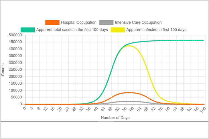
Varpe’s desktop web application includes additional parameters and graphs. Her visualization uses data from a mathematical model based on the spread of COVID-19 in New York City, throughout spring 2020.
She hopes her visualizations can be used by decision makers to help compare different cases. For example, decision makers could compare how quickly a spike can be controlled, based on how many vaccines doses are available and the number of active cases.
Varpe said that managing the slider bar functionality on the backend of the web application was a challenging aspect of her work. In order to make the graphs interactive, she had to make sure users receive instant feedback when they move a slider bar.
“This data is important and we need to make sure people can understand it,” said Varpe, who is from India. “If we can save some lives by helping people better understand these models, that would make me very happy.”

