Visual Exhibition 2026

The College of Art and Design's Visual Exhibition is a juried showcase of creativity for RIT's Graduate Showcase! It represents exemplary work by students from our renowned graduate programs.
Best in Show
Denna Alece (visual communication design)
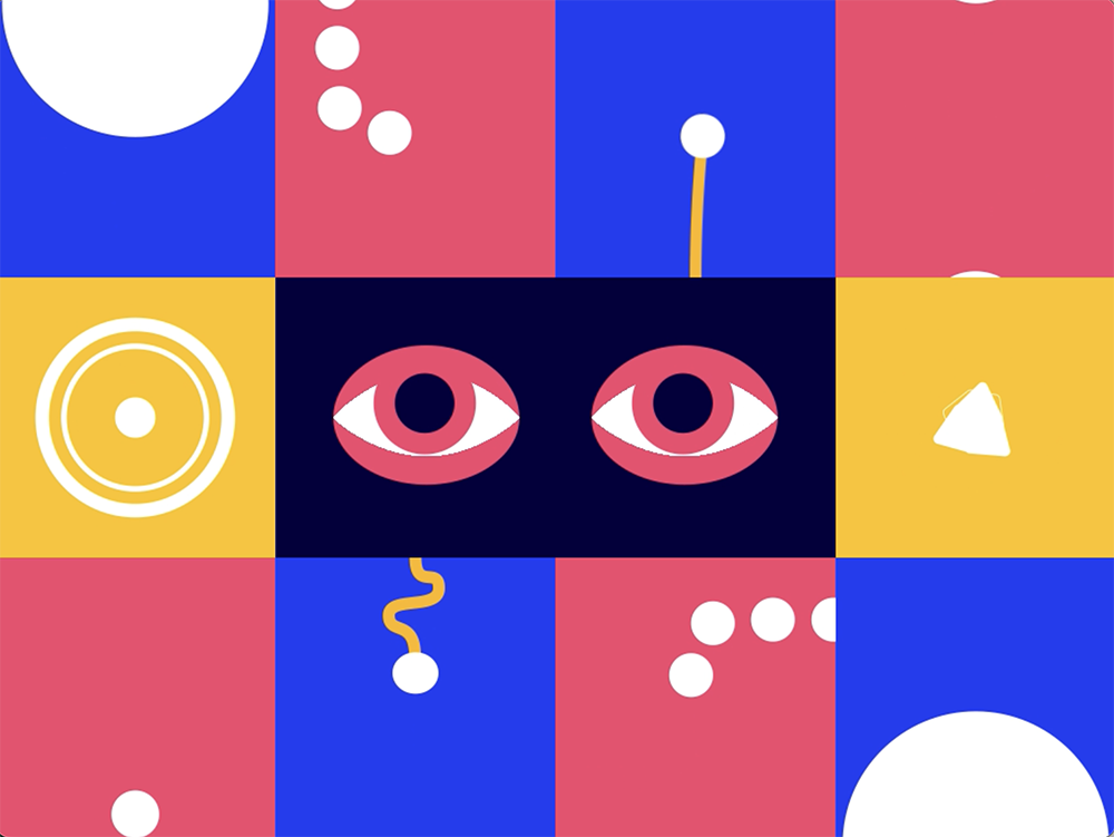
Modular Animation
This modular animation was created utilizing small square frames to create a unified fully animated piece. Focusing on rounded shapes and how they move within the frame, the modular squares give a sense of united animation by flowing into one other, or being connected. The eyes in the center serve as a focal point, and a reflection of observing and being observed.

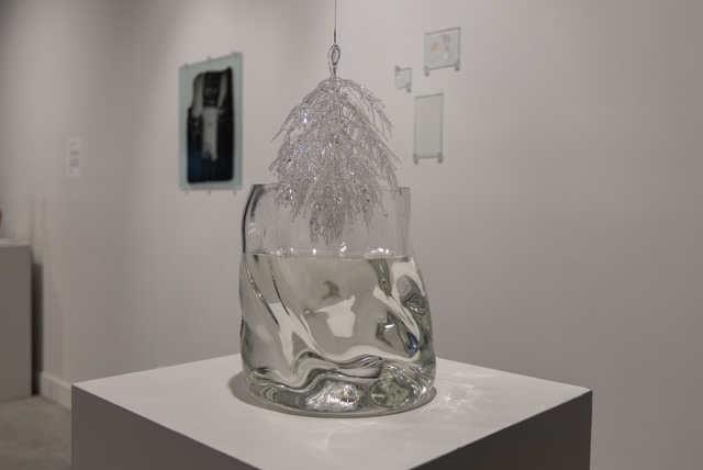
Isabella Condorelli (glass)
Sea Angel (left) and Saffron Tulip (right)
The colors and forms of these glass sculptures originally took inspiration from sea creatures, specifically translucent organisms like jellyfish and sea angels. These pieces were hot sculpted in a hot shop. The surface of these glass sculptures are sandblasted and treated with liquid luster to achieve a satin, translucent effect that many of those creatures share.
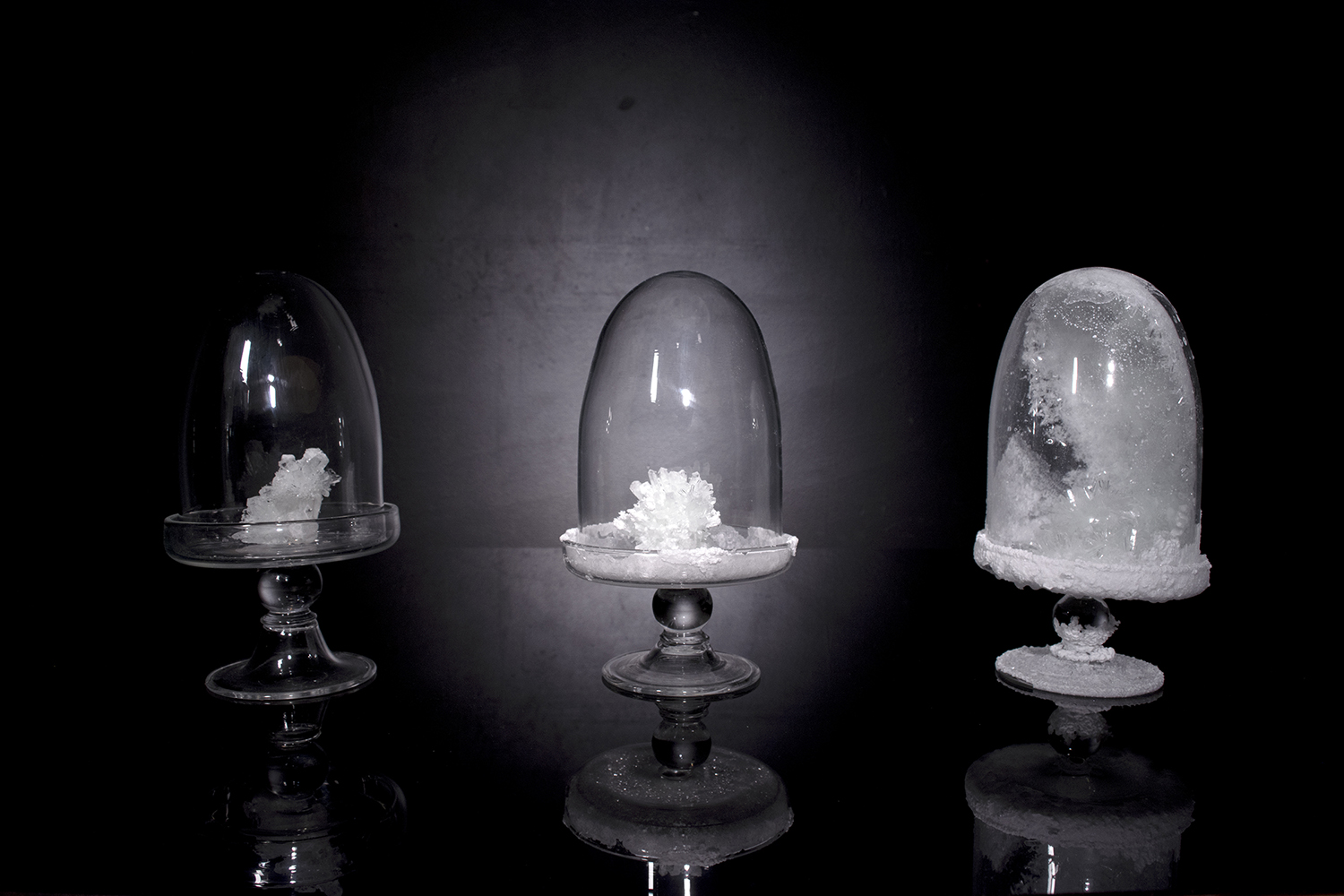
Bronagh Dempsey (glass)
Veiled
This body of work explores the intersection of unseen strength through root structure, rebirth, and plant adaptation through immortalizing temporary flora with everlasting glass. Discussing familial bonds and unseen connections to one another after all that’s left are memories and passed-along traits.
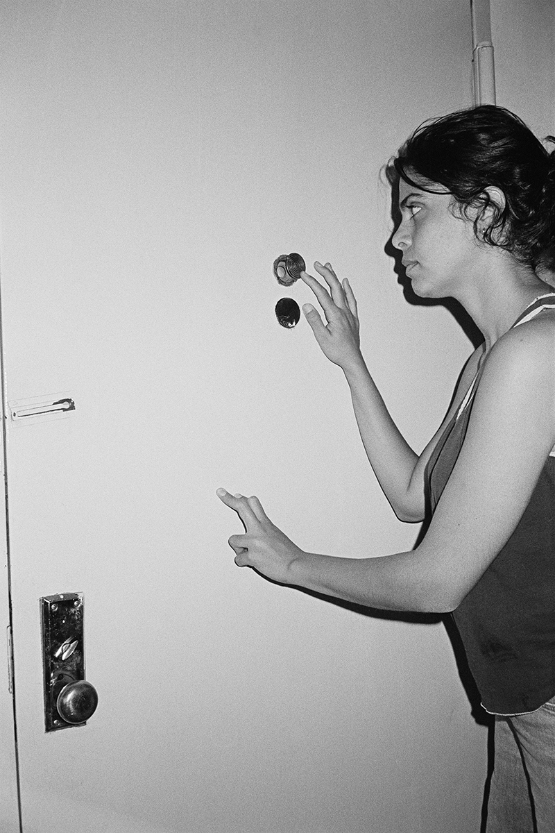
Tomer Feigin (photography and related media)
I Always Walk on Tiptoes
My work explores and materializes states of play by combining experimental photography and analog color printing. The photographic series "I Always Walk on Tiptoes" (אני תמיד הולכת על קצות האצבעות) explores gestures, means of control, fantasy and notions of chance. Working primarily with analog photography, I use my own body to create postponements and disruptions between the light of the enlarger, the negative and color sensitive paper. The unique chromogenic prints are made by multilayering, hiding and revealing pathways of light.
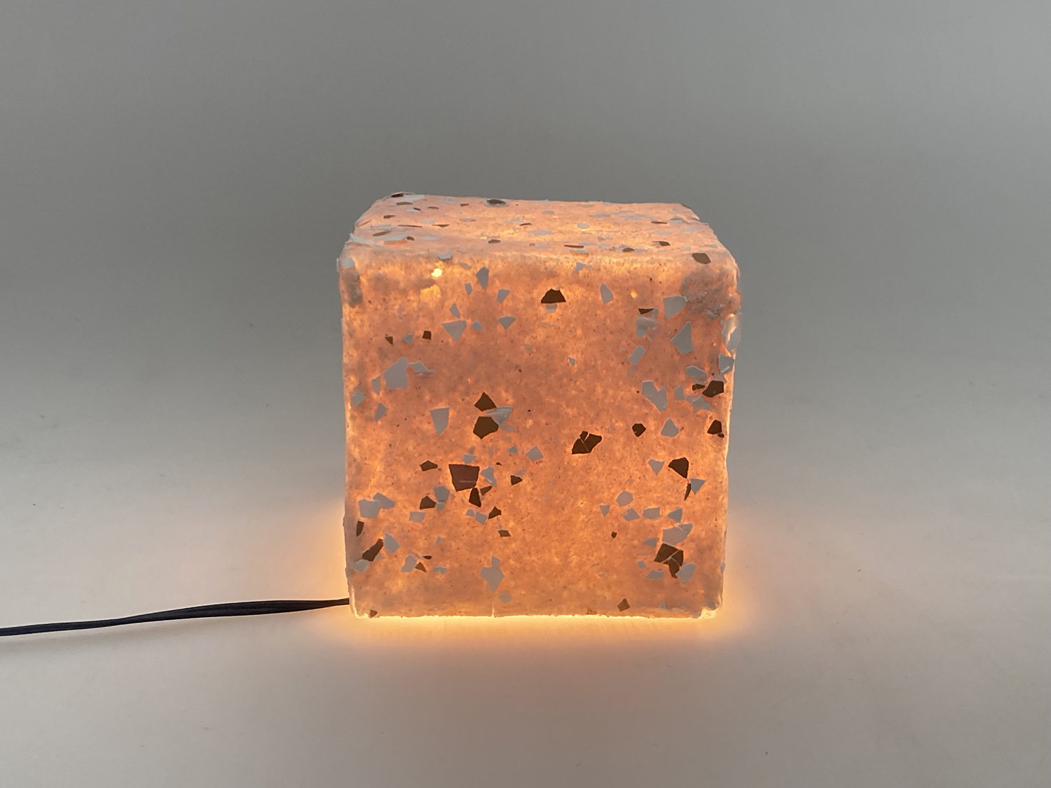
Evan Gerstein (industrial design)
Lamp
I became interested in using casein because I was researching the history of Rochester and learned that in the first half of the 20th century, there was a button factory here that made buttons from casein. I then learned that casein, back then, was a widely used industrial material — to make buttons, hairbrushes, eyeglasses, and even as a wool substitute for jackets and clothes. It was an early plastic: easy to mold and plentiful as dairies were throwing out the milk left over from butter and cream production. Back then, however, the casein was hardened using formaldehyde. I was curious if I could make objects from casein without using formaldehyde to use casein as a case study to show that there are historical materials, which have largely disappeared as a result of petroleum plastic, that deserve revisiting. The casein is precipitated by adding vinegar to milk and then mixed with ground eggshells to form a Play-Doh-like material, which is then slumped over a 3D-printed mold. The eggshells came from Ritz cafeteria. I wasn't able to find a source for the dairy, but ideally, the milk would be a dairy farm's waste from the production of butter or cream. This lamp is a 3-inch cube, and I imagine it as accent lighting. It provides a warm glow for a room, and when it is off, it doesn't necessarily look like a lamp.
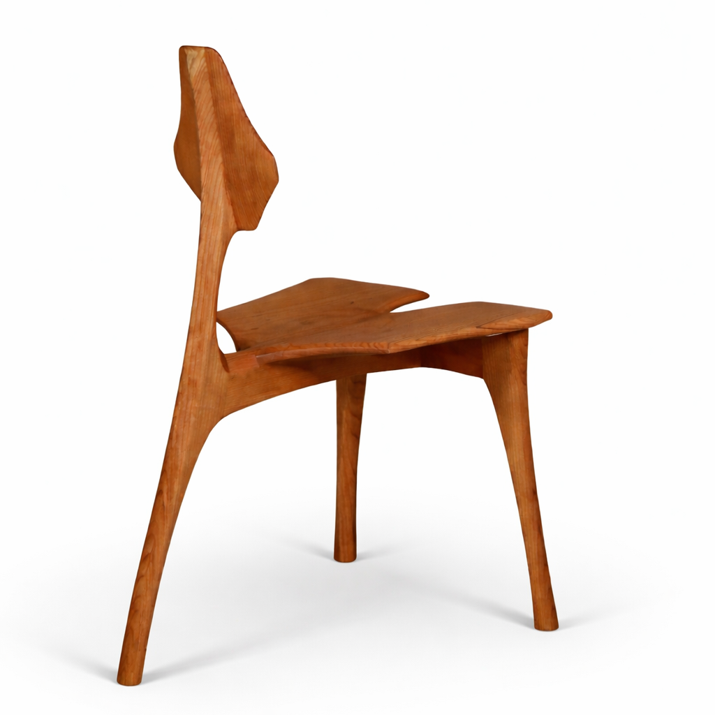
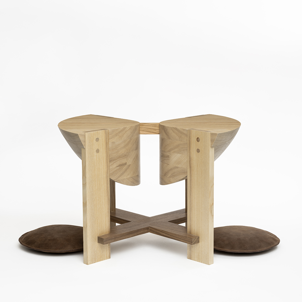
Syed Muhammad Hasan (furniture design)
Chair
This chair is a study in balance and restraint. Crafted from cherry wood, it stands on three seamlessly integrated legs, each connecting to the next in a fluid form. Its refined geometry offers both steady support and a light, delicate presence. Every curve and surface is intentionally placed, allowing the piece to remain both purposeful and elegant in its simplicity.
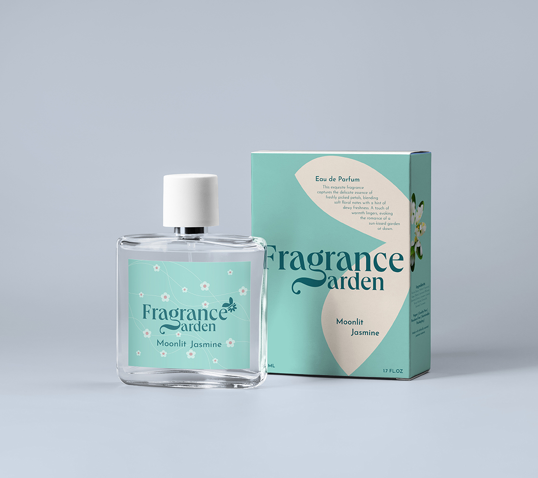
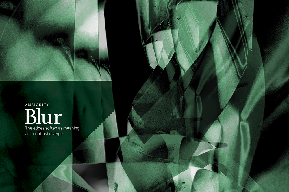
Shruti Nandiwdekar (visual communication design)
The Fragrance Garden
The Fragrance Garden branding system translates the ephemeral, sensory experience of botanical scents into a sophisticated and cohesive visual language. This comprehensive project features a minimalist floral motif that scales seamlessly across high-end physical packaging and a fluid digital interface. By integrating custom typography with organic imagery, the design bridges the gap between traditional luxury aesthetics and modern UI/UX principles. The final identity emphasizes sustainability and elegance through every customer touchpoint, from the retail shelf to the mobile screen. Ultimately, this polished case study demonstrates high-level design thinking and commercial readiness suitable for a global audience.
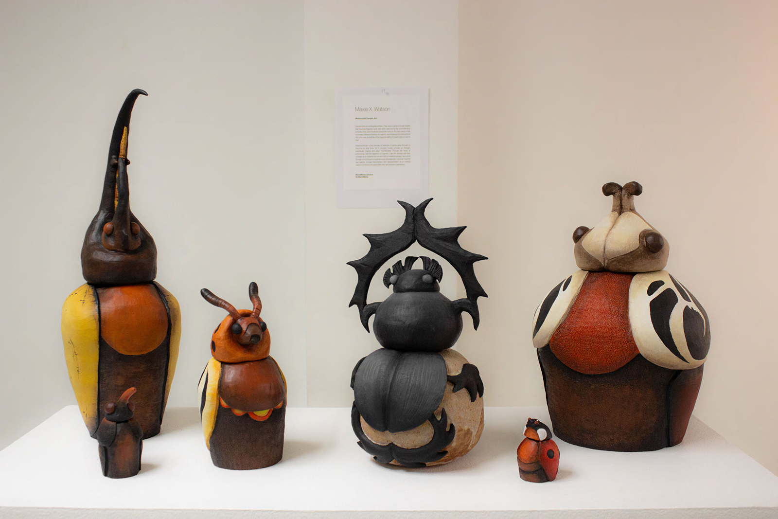
Maxwell X. Watson (fine arts studio)
Metamorphic Canopic Jars
Canopic jars are an Egyptian artifact. They were a series of small vessels that depicted Egyptian gods that were used during the mummification process. They used the jars as a separate tomb for the vital organs of the mummies. Instead of holding my organs, I want these jars to hold parts of me, who I was, and some of the negative parts of myself I want to “put to rest.”
Metamorphosis is the process of evolution a being goes through to become its final form. It’s a process mostly animals go through, specifically insects and other invertebrates. Through the study of entomology and the depiction of insects, I use the animals and their changes as a metaphor for my own kind of metamorphosis I have gone through and continue to experience as a transgender individual. I want to use insects, through interpretation and representation, as an indirect vessel to embrace and appreciate who I am and who I was before.
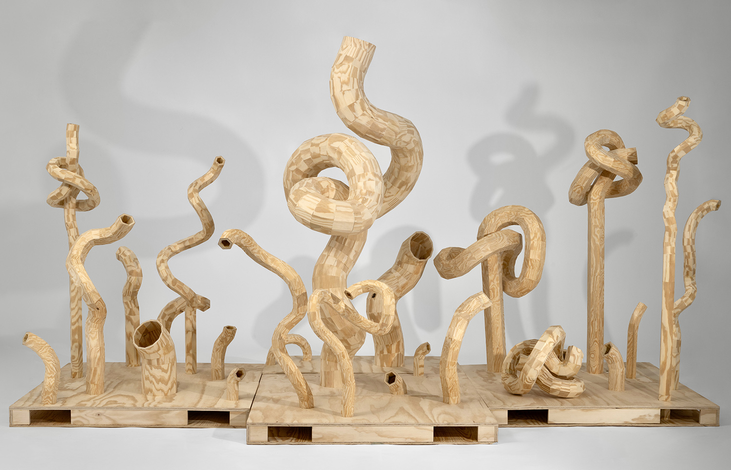
Misa Yo (fine arts studio)
Through the Knots
"Through the Knots" is built from small units that merge into an immersive environment, emphasizing repetition through uniqueness. Inspired by the sensation of walking through a forest, each sculptural form functions as a “doodle figure” drawn into space. Using consistent building blocks of 5, 10, and 15 degree angles, segmented pieces form lines, surfaces, and rhythms that feel both improvised and intentional. This sculptural installation is composed of hexagonal and dodecagonal plywood tubes that are cut, rotated, and reattached at precise angles to form twisted and knotted structures. Through a repeated process of cutting and joining, flat sheets of plywood are transformed into an organic system that appears to grow or sprout beyond its original form. Although each component is constructed using the same method, subtle variations naturally emerge, shifting the work from uniformity toward individuality, allowing each element to develop its own presence. Together, these forms create a visual language that is shared yet continually evolving.
Schools of Art and American Crafts
Hannah Giancola (furniture design)
A Place to Talk, a Time to Listen
This piece explores the feeling of disconnect in regards to political, moral, and current views of the world. It demonstrates an example of space created on equal ground, connecting opposed points of view and encouraging directness but providing comfort. While influenced by the most recent turmoil in the Middle East, it speaks to a more timeless experience we all seem to be having of feeling helpless and hopeful but always alone. This setting represents the pursuit of something more human. It embraces the grey zones where most of life exists and gives space for a more constructive approach, one not aimed at agreement but understanding.
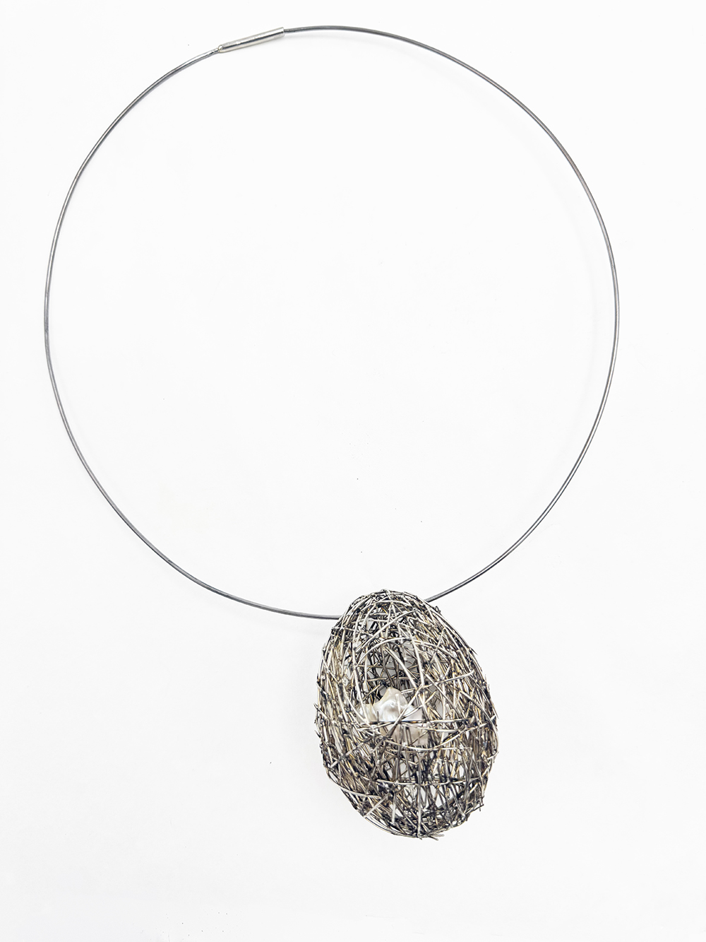
Liyun Yu (metals and jewelry design)
Necklace
This necklace is formed from bent sewing needles into an egg-shaped nest that holds a single pearl. The pearl is visible through the opening, yet it cannot fall out. Rooted in my personal experience of family love shaped by control, the piece reflects the tension between protection and confinement. The nest suggests warmth and care, but its structure—made of sharp needles—carries quiet danger. The pearl becomes a metaphor for myself: cherished, guarded, yet restricted. Through this work, personal memory is transformed into a shared space for questioning how love can wound—and how stepping back can be an act of survival rather than betrayal.
School of Design
Lo Fasano (visual communication design)
Not a Butterfly
Reinterpreting Matsuo Bashō’s famous haiku, this generative art motion piece visualizes metamorphosis not as a biological event, but as a suspended, cosmic cycle. Developed through a modular workflow, the final translates hand-drawn (frame by frame in Procreate) animations into particle fields and symmetrical mandalas generated in TouchDesigner. The generative renders were then composited and sequenced in AfterEffects to create a narrative that moves from literal to surreal.
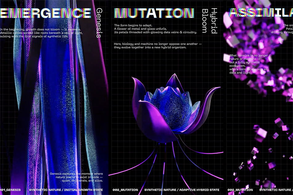
Dikshita Goswami (visual communication design)
Synthetic Nature
Synthetic Nature is a triptych film exploring artificial ecosystems built entirely through simulation. Each panel presents a distinct environment governed by procedural forces — growth, erosion, atmosphere, and decay. The work examines how “nature” can be constructed, controlled, and aestheticized through digital systems. What appears organic is in fact synthetic — a choreography of algorithms performing life.
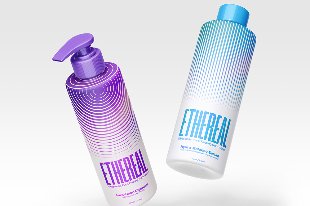
Jatin Joshi (visual communication design)
Ethereal Brand Identity
Ethereal is a conceptual hair-care design system that translates the visual and physical behavior of Ethernet cables into a brand identity embodying connection, flow, and renewal. The project bridges digital precision with organic flow, featuring a cohesive identity system, 3D packaging design, and a motion teaser tailored for design-conscious consumers.
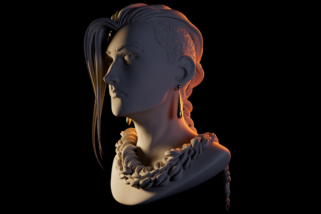
Sebastian Richard (visual communication design)
3D Sculpted Character Design
A stylized 3D-rendered bust of a person with an undercut hairstyle and a long braid that wraps around their neck like a coiled necklace, sculpted to resemble smooth stone, with the exception of their golden earrings, meant to evoke a sense of opulence in the portrait. While their face is partially obscured by their hair, their expression is calm and focused. Cinematic lighting casts cool shadows and warm highlights across the face and shoulders, set against a deep black background that emphasizes the sculptural form.
Rachel Seaton (visual communication design)
Conditions May Vary: An Almanac of Emotional Atmospheres
"Conditions May Vary: An Almanac of Emotional Atmospheres" is a process-driven visual system built from a single seed. Through analog and digital transformation, one source image generates a range of distinct visual states, each shifting in texture, form, and intensity while retaining a shared origin. The project centers derivation and variation as methods of image making. Informed by core affect theory, the resulting images are organized into a coherent visual language for emotional atmospheres of creation.
School of Photographic Arts and Sciences
Jesse Gwilliam (photography and related media)
Crave Nothing More Fervently
"Crave Nothing More Fervently" is a personal intervention with my fear of time’s ceaseless procession forward. I reflect on this anxious experience and search for new ways of being by connecting to the people and places who have influenced me most. Through the establishment of a personal visual style I deem psychedelic perception, I look for a future that struggles against my personal fears of loss and death. My approach uses psychedelic perception to create an aesthetic visual approach that views the world in radical new ways. I look towards a future that doesn’t accept anything as a given; I look for life open to the endless possibilities of a creative existence.
School of Film and Animation

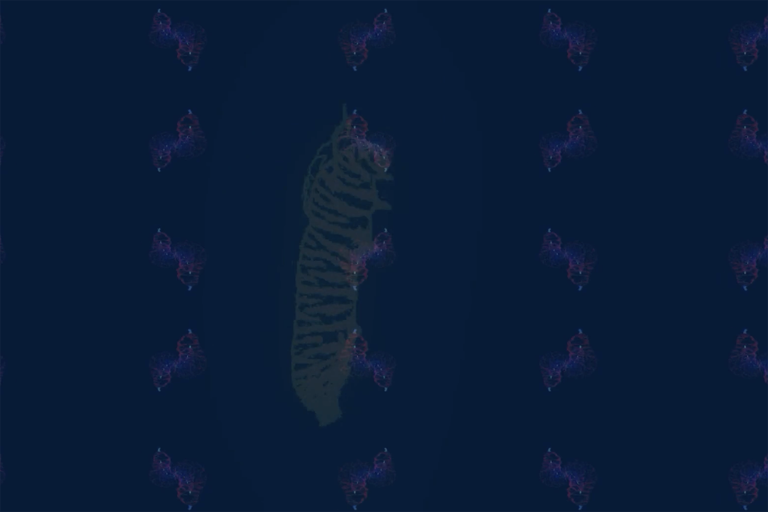
Ceian Thomas (film and animation)
Digital Art
These are character designs illustrated to fit the aesthetic called "Atom Punk." This aesthetic is known for bringing together futuristic technology and reimagining it in a retro 1950's lens. The fashion sense and gadgetry lends itself to the cold war era of art and putting a melanated spin on it.