RIT Rallies: Professor builds interactive coronavirus mapping tools to contextualize the pandemic
Maps provide insight on COVID-19 cases in relation to hospital locations and elderly populations
Brian Tomaszewski
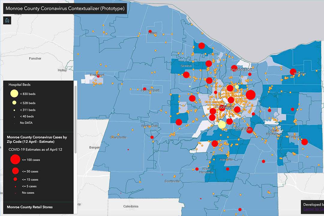
A map of Monroe County that depicts coronavirus cases in relation to hospital locations, hospital bed capacities and vulnerable populations. Brian Tomaszewski, associate professor at RIT, created the map to provide better context about the coronavirus pandemic.
Brian Tomaszewski, an associate professor at RIT, is working to create interactive coronavirus maps that provide deeper insight into the spread of COVID-19. He hopes the public can use these mapping tools to help fight the pandemic.
“Now, more than ever, maps are essential for decision making and staying informed about this global threat,” said Tomaszewski, who also lab director of RIT’s Center for Geographic Information Science and Technology.
In recent months, many government agencies and media outlets have been using maps to visualize data and the spread of coronavirus. When Tomaszewski studied these maps, he noticed that most of them only emphasized the number of cases and deaths in a region.
“Other existing mapping tools do not provide much context – just raw counts of data as point symbol in dashboards that are useful for general updates, but not for deeper context,” said Tomaszewski. “The dashboard tools are somewhat limiting, in my opinion.
He wanted to see maps that show coronavirus data in relation to other things at a state and local level, including hospital locations, grocery stores and vulnerable populations. Using his own Python tools, ArcGIS maps and by incorporating reliable datasets, he began to create several map prototypes.
Brian Tomaszewski
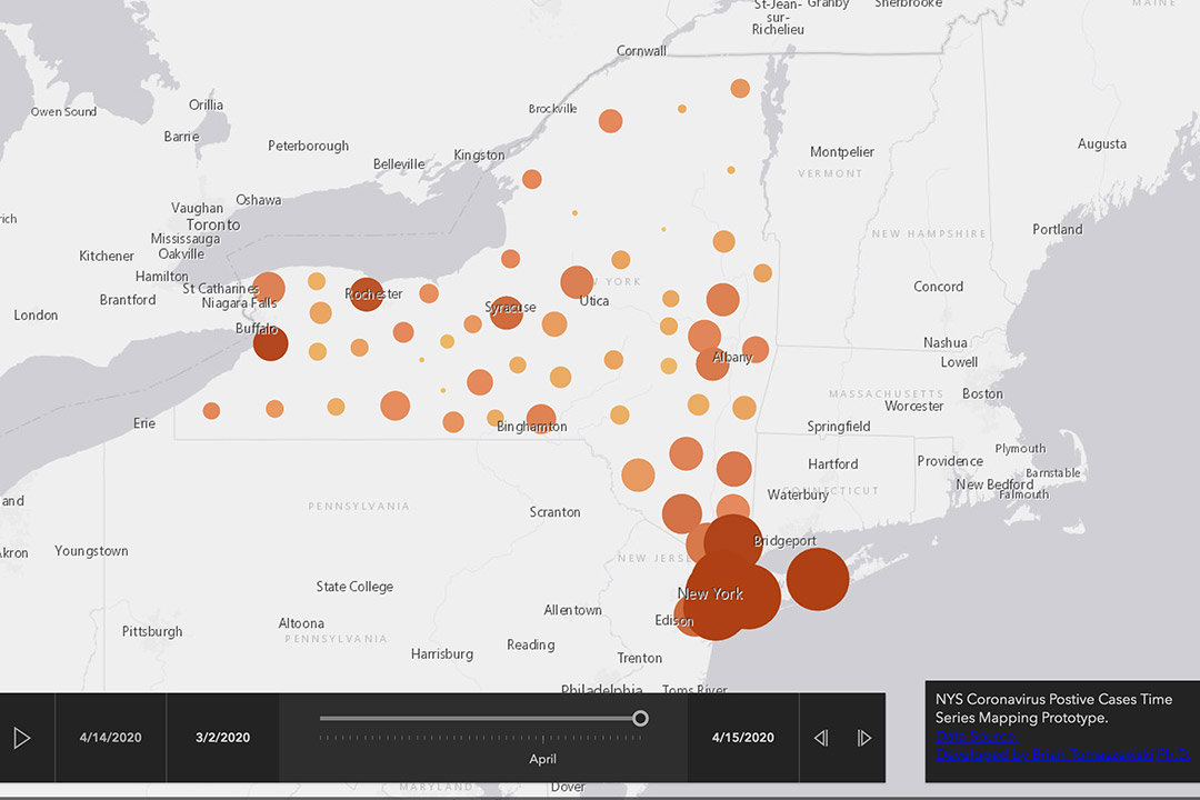
A time series map of New York state coronavirus cases.
One of his animated maps shows a time series of the number of cases in New York state by date, in relation to the total population of each county.
Another map created by Tomaszewski provides a deeper look at New York state’s Monroe County. The map shows coronavirus cases by ZIP code, in relation to hospital locations and bed capacities, at-risk populations (those 60 years of age and older) and grocery store locations.
Tomaszewski is also encouraging others to get involved and create maps for their own towns, counties, states or countries, in order to help their governments and communities. He created a YouTube tutorial to teach people how to create their own coronavirus maps, using free and open source tools and data.
“This is much bigger than GIS — if you identify as a maker, there is tons of opportunity here to hack and make things that help people,” said Tomaszewski.
The mapping project inspired Tony Jefferson, a principal lecturer of interactive games and media, to create an extra credit assignment for his Rich Media Web Application Development I course. One student is planning to develop a search tool that combines eBay product locations and coronavirus infection rates. The aim is to allow users to better understand the risk of ordering from certain areas and factor that information into their purchases.
For more information, go to Tomaszewski’s Contextualizing Coronavirus website.

