Kosovo Branding
Branding Matters
RIT Kosovo’s visual identity represents the institution at the highest level and plays a central role in how we are recognized. Logos and core visual elements act as identifiers and marks of quality and must remain consistent across all official communications.
Branding at RIT Kosovo extends beyond visual elements alone. It is reflected in the clarity, tone, and professionalism of every interaction, academic, administrative, and public-facing.
This guide supports informed branding decisions and provides direction for maintaining consistency across platforms, audiences, and communication formats.
Primary Logos
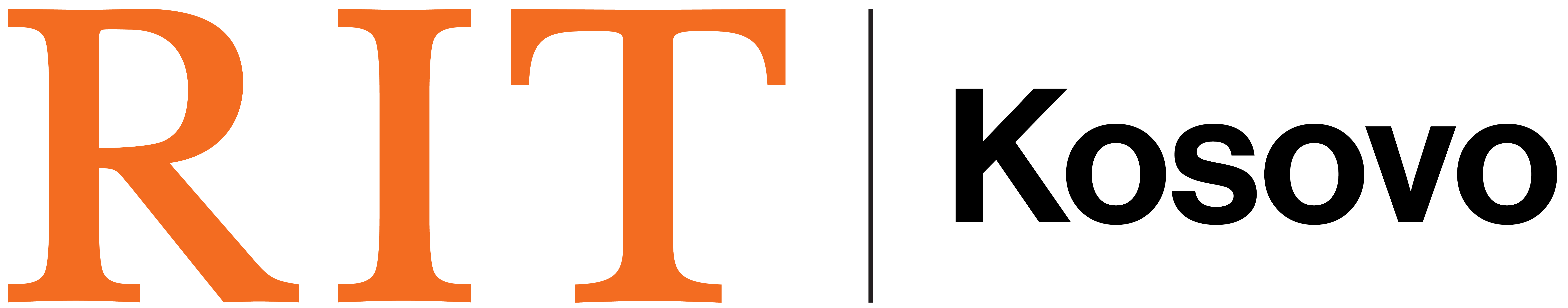
Primary Logo
Our primary identifier is the RIT Kosovo letter mark. It represents the strength and rigor of our academic offer. It must be present in its original format on all communications. This is the university’s simplest logo and most recognizable mark. It can be used alone when supported by other identity assets or when the audience is well acquainted with the brand.
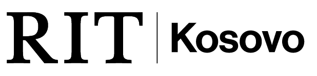
Primary Logo Black
Our identifier is the RIT Kosovo letter mark in Black. It represents the strength and rigor of our academic offer. It must be present in its original format on all communications. This is the university’s black logo. It can be used alone when supported by other identity assets or when the audience is well acquainted with the brand.
Primary Logo White
Our identifier is the RIT Kosovo letter mark in Black. It represents the strength and rigor of our academic offer. It must be present in its original format on all communications. This is the university’s black logo. It can be used alone when supported by other identity assets or when the audience is well acquainted with the brand.

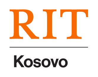
Secondary Orange & White
Our Secondary identifier is the RIT letter mark in orange & Kosovo in white. It represents the strength and rigor of our academic offer. It must be present in its original format on all communications. This is the university’s secondary logo. It can be used alone when supported by other identity assets or when the audience is well acquainted with the brand.

Primary Logo White
RIT Kosovo in all white available to be used on black backgrounds. RIT letter mark & Kosovo in white. It represents the strength and rigor of our academic offer. It must be present in its original format on all communications. This is the university’s logo. It can be used alone when supported by other identity assets or when the audience is well acquainted with the brand.


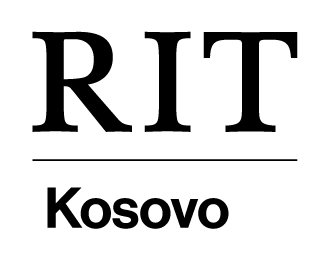
Logo Stacked
The stacked version sets the RIT lettermark and the wordmark in two lines. This more compact configuration may provide more flexibility in placement and scale.
Logo Stacked
The stacked version sets the RIT lettermark and the wordmark in two lines. This more compact configuration may provide more flexibility in placement and scale.
Logo Stacked
The stacked version sets the RIT lettermark and the wordmark in two lines. This more compact configuration may provide more flexibility in placement and scale.

Logo Stacked
The stacked version sets the RIT lettermark and the wordmark in two lines. This more compact configuration may provide more flexibility in placement and scale.