Celebrating creativity: MFA students capture international design honors
Projects from several classes in RIT’s visual communication design MFA program were recognized as exemplary graphic and communication design in an international competition.
Five students and recent alumni of the visual communication design program won several student categories in Design Masterprize, a juried showcase that promotes global excellence in several design fields. Jurors who evaluated the submitted work from around the world included distinguished designers at companies such as Amazon and Google.
The Graphic and Communication Design section of the competition honored RIT projects ranging from print and typographic works to event branding and advertising. Each was created in Assistant Professor Anne Jordan’s Typography, Information Design, and Design Systems classes.
The RIT honorees are:
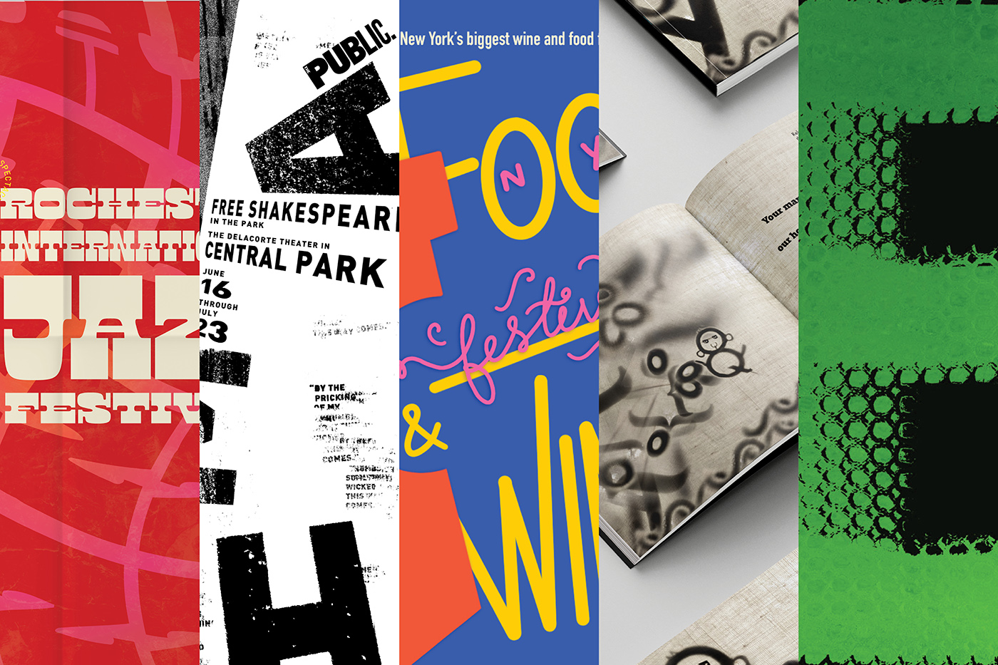
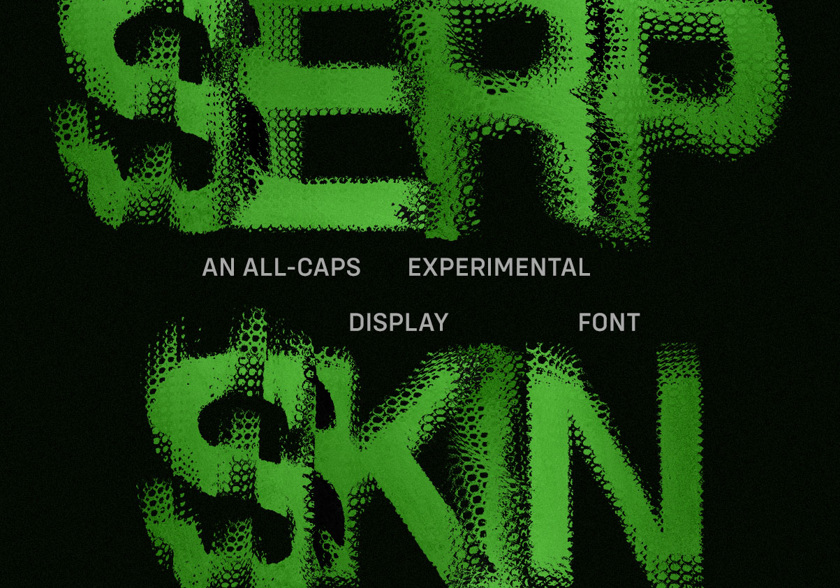
Ritul Chaudhary ’25, winner, Typography for “Serp Skin”
Ritul Chaudhary
“Serp Skin” is an all-caps experimental display font that emulates the texture of serpentine scales. It is a revised font inspired by Helvetica Bold, created by photographing a fabric mesh with scale-like texture followed by digitally distorting the letterforms.
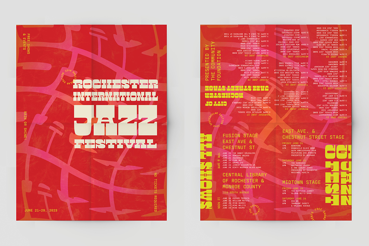
Honey Gardharia ’24, winner, Posters for Rochester International Jazz Festival Brochure
Honey Gardharia
The project explored the rhythm and soul of the Rochester International Jazz Festival through a dynamic typography design — a lively brochure that captured the essence of jazz. The interplay of fonts mirrored the diverse musical genres featured in the festival, guiding viewers through lineups, venues, and events with a rhythmic flow. The typography invited viewers to explore the rich sounds and stories that defined the festival.
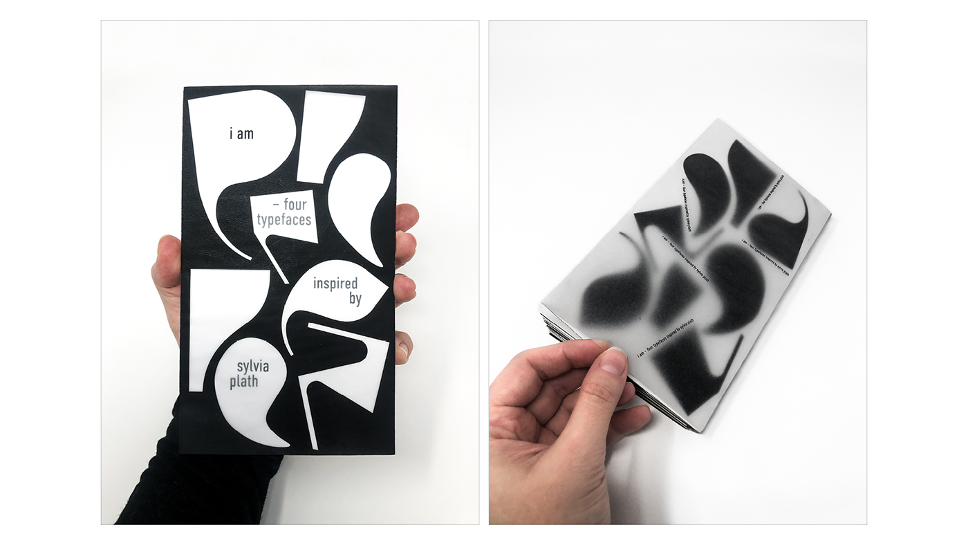
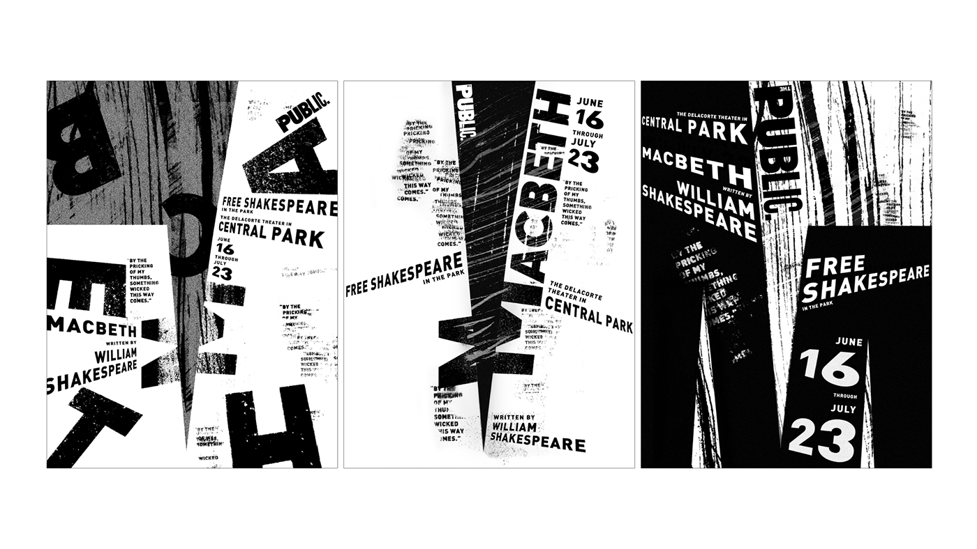
Ipek Köprülülü ’24, winner, Typography (“I Am”) and Posters (“Macbeth”)
Ipek Köprülülü
“I Am” demonstrates a collection of four typefaces inspired by Sylvia Plath. Each is tightly connected to the mental stages she reflects on and shown through her selected quotes. They explore the fragility that a strong woman faces, the feeling of being stuck in the norms, the depression that pulls you down, and the lack of decision making between the stereotyped paths.
Ipek Köprülülü
This triptych of posters is conceptualized for a Macbeth play at Shakespeare in the Park, a signature theater event presented by the Public Theater in New York City. Designed as a dynamic system, the posters function both individually and as a cohesive whole. The concept revolves around using a cut “M” shape, symbolizing both a dagger and the removal of the crown, representing the struggle for power in Macbeth.
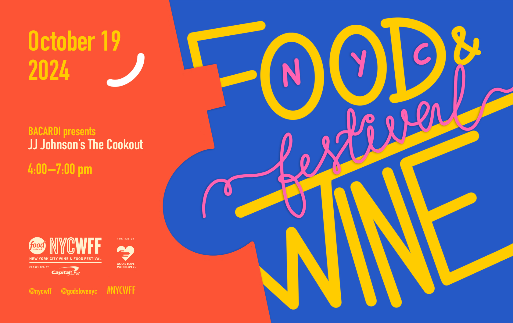
Ipshita Pal ’24, winner, Advertising for “New York Food and Wine Festival”
Ipshita Pal
This project reimagines three outdoor brand systems for the New York City Wine and Food Festival, forming a cohesive yet distinct triptych that captures the event's vibrant character. The redesign establishes a unified visual language across various platforms while each retains unique traits to differentiate them subtly. To create a fresh perspective, “New York Food and Wine Festival” replaces the original phrasing, lending a unique feel to the brand.
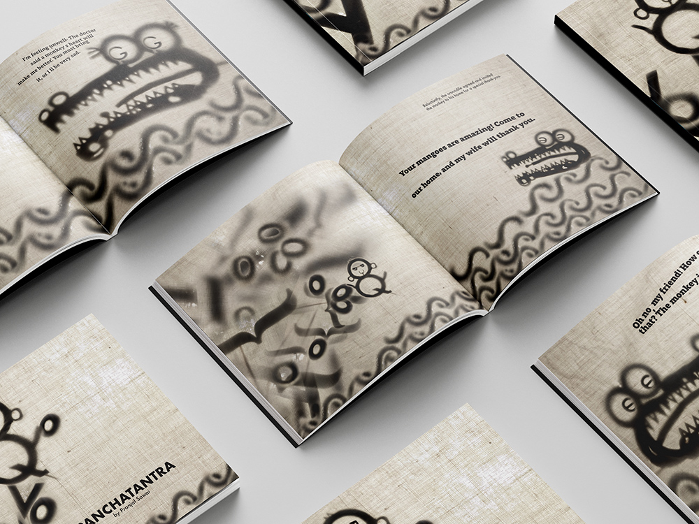
Pranjal Sawai ’24, winner, Print and Books for “Typographic Shadows”
Pranjal Sawai
“Typographic Shadows” reimagines ancient Indian Panchatantra fables through a modern design lens. The project breathes new life into these timeless tales by blending traditional shadow puppetry with contemporary typography. Meticulously crafted letter puppets cast shadows to form characters and scenes, each defined by a unique typeface. The creative process involved crafting puppets, setting scenes with controlled lighting, and digitally composing dynamic images.