Student work on display at Ganondagan State Historic Site
Jordana Deutsch, fourth-year industrial design major
Mindy Magyar
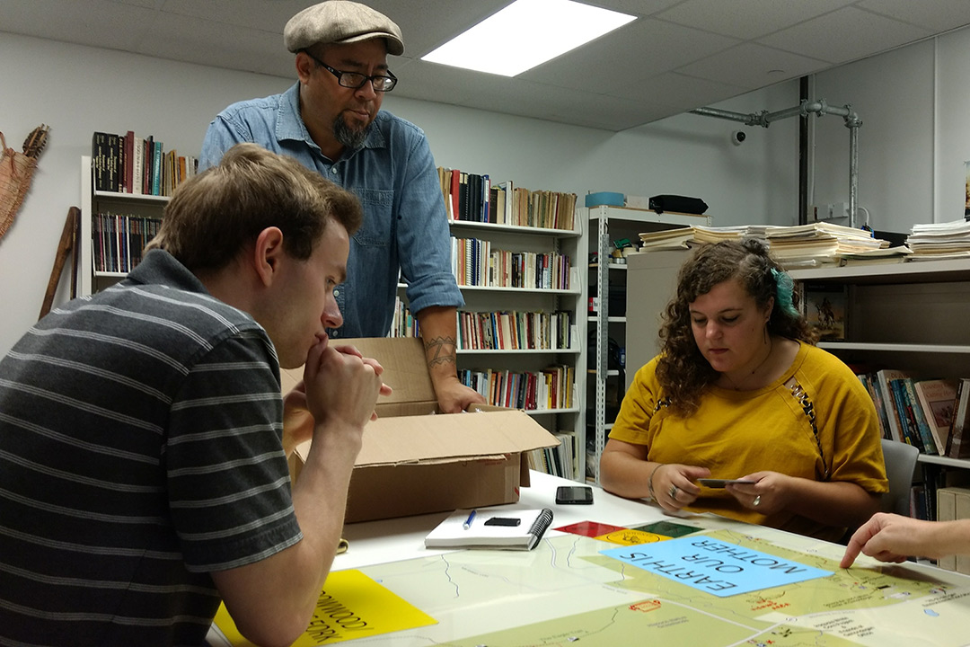
Jordana Deutsch (right) and her partner Matthew Hough (left) meet with Michael Galban, the curator and interpretive program assistant at Ganondagan (center).
Jordana Deutsch, a fourth-year industrial design student from Manasquan, N.J., welcomed an experience working with an off-campus client in Fall 2017. As part of the industrial design program’s annual design blitz called T-Minus, students worked with Ganondagan State Historic Site to develop a site-specific wayfinding system respecting Haudenosaunee culture and aesthetics. After the project ended, Deutsch and Matthew Hough, a graphic design student, continued to work with Ganondagan to refine the proposed design. They created a wayfinding system that welcomes visitors to the site and guides them through 569 acres of trails.
While this project drew mostly on Deutsch’s graphic design skills, she fell in love with industrial design when she toured RIT’s program before applying.
Deutsch finished her contributions to the project in Fall 2017. Currently, two kiosks displaying the redesigned map are up and running at Ganondagan. The museum plans to install the welcome sign and more kiosks for the maps throughout the site in the future.
Question: How did you join this project?
Answer: The project originally started as a T-Minus project in 2017, a competition that the industrial design program puts on at the beginning of spring semester every year. Later on, we were contacted by Ganondagan and they liked what we did. So, they wanted us to continue our work and make it a reality. They contacted us toward the end of that spring semester, so last fall I finished up the project as a part of an independent study.
Question: How did this project help the museum?
Answer: The map that the museum had before we started this project was really hard to understand and wasn’t very clear to readers. We simplified the map so anyone could read it, see where they are and figure out where they need to go throughout the site. For the welcome sign, the original one had wrong information on it and was generally unclear for visitors. I revamped the overall design and included iconic elements from the historic site, such as the Ganondagan Man. Design elements on the welcome sign were also used in the map to make the pieces more cohesive. The sign and maps will be installed at the museum when their staff is able to finish the logistics, like building the rest of the kiosks.
Question: What did you do specifically to help improve these features?
Answer: I worked with a graphic design student and we worked on making the map more user friendly. We changed colors around and made the trail map easier to use. We didn’t make the trail on the map exactly like the trail is in real life, we just followed the general curves and turns of the trails so it was easier to read. We also added a definition between forested areas and clearings on our map so people could easily identify these different areas.
Question: How did the knowledge you gained at RIT help with this project?
Answer: My classes gave me a lot of insight about user experience and helped me understand that not everyone sees things in the same way. For example, one of the people I was working with, Professor Bruce Leonard, is slightly colorblind, so having his input on our designs made us more aware of our color choices. We couldn’t put red against green because not everyone can distinguish between the two.
Question: What was the most exciting part of working on this project?
Answer: I really liked having the experience of working with an outside client. It was my first time working on a real project outside of class that was actually going to be used somewhere. Real people are going to see and use my designs.
Question: What are your plans for after you graduate?
Answer: I honestly don’t know any specifics yet, I’m just going to apply to places and see where I can get in.
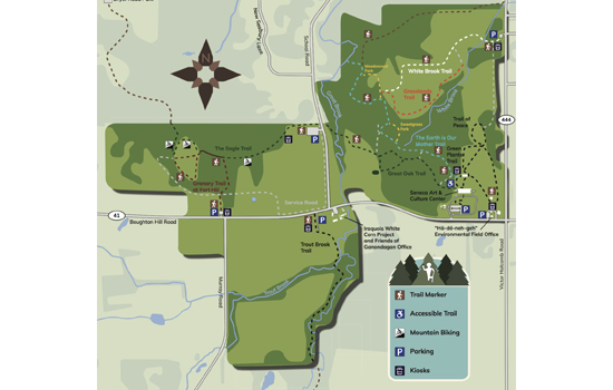 The map created and designed by Deutsch and Hough.
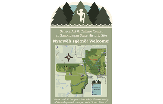 The welcome sign designed by Deutsch and Hough.