RIT graduate's City of Rochester logo design carries enduring legacy
Courtesy of Lee Green
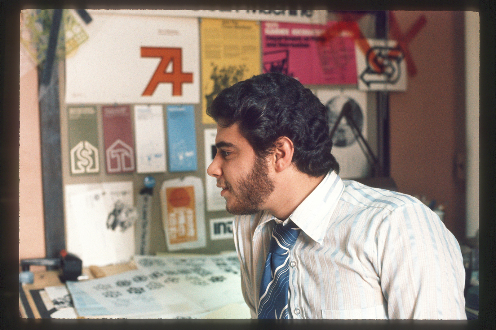
Lee Green '74 MFA (design) worked as the City of Rochester's first full-time graphic designer in the 1970s.
When Lee Green ’74 MFA (art and design) was leading the brand experience and strategic design of IBM, he presented at a conference and mentioned one of his early-career milestones.
An attendee later tracked him down, rolled up a sleeve and revealed a tattoo on his arm. It was lilac petals crossed with a gristmill wheel — easily identified by Rochester, N.Y., residents as the city mark.
“What I was hearing from him is that he loved living in Rochester,” Green said. “Since then, I’ve heard similar stories about the pride people feel about living in the city. The mark gives them a visual focal point for that.”
Green designed the city’s logo, which was officially approved by the city council in 1976. Fifty years later, the mark is unchanged, beloved as ever, and a symbol of civic pride.
The City of Rochester recently premiered a 70-minute documentary celebrating the mark’s origins, timeless design and enduring legacy in Rochester. City Mark: A Rochester Icon uses archival footage, community voices and new interviews to deliver a story about the impact of good design, and how the logo united city departments and shaped Rochester’s visual identity.
Green developed the mark while serving as the city’s first full-time graphic designer. He left the role in 1979 for IBM, where he spent the final 36 years of his design career. Green retired from IBM as corporate vice president in charge of IBM’s global design and branding initiatives.
Green was presented a key to the city by Mayor Malik Evans at the film’s premiere in May.
“There are a lot of examples of graphics developed at the time that really started to create a design system in the city,” Green said. “To some degree, it is followed today, in addition to the consistent use of the mark.”

Courtesy of the City of Rochester
Rochester Mayor Malik Evans, left, presents a key to the city to Lee Green.
Green said he had heavy autonomy in creating the logo and associated branding. In researching the city’s seal and history, he aimed to clearly visualize Rochester’s dual identity as “Flower City” and “Flour City.” In the 19th century, it developed into a major horticulture hub and one of the world’s largest flour producers.
“I looked for some common denominators to guide a simple graphic,” Green said.
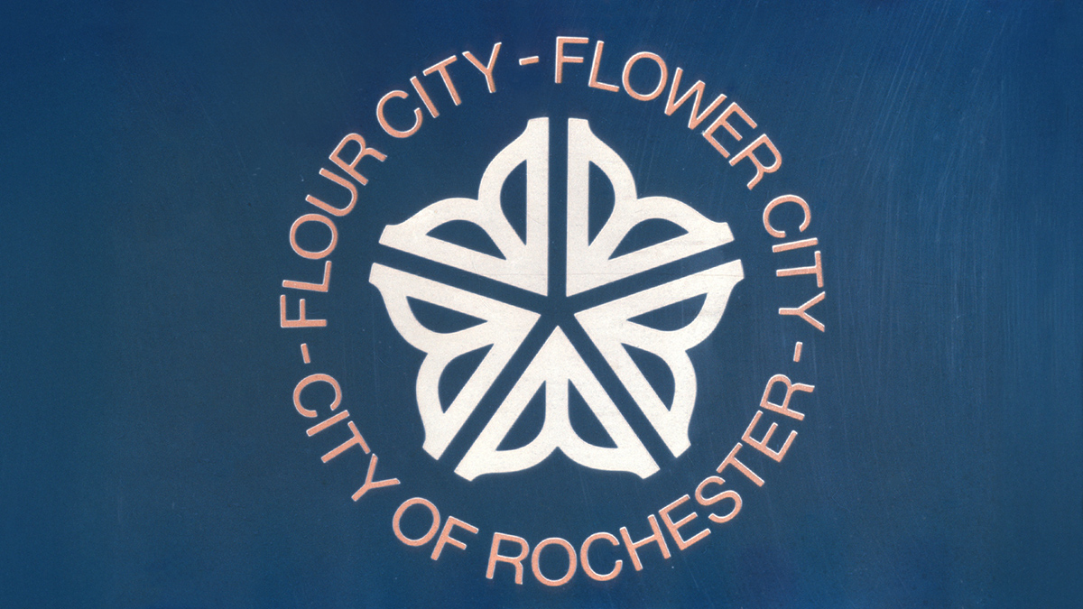
Green’s city mark blended both nicknames into a single visual identity, enjoyed and embraced by locals and visitors for five decades. The logo’s lilac, intersected by spokes of a wheel system used to grind grain into flour, represent those merged histories.
“I remember taking both of these images, which I had photographs of, and overlaying them on a light table,” Green said. “You could begin to see the origins of a five-petaled flower and spoked graphic. That evolved into the design of the city mark.”
Courtesy of the City of Rochester
For 50 years, Rochester's city mark has shaped the city's visual identity.
The RIT ties in the new documentary run deep.
Among those featured are RIT leaders — including Professor Emeritus R. Roger Remington — who spearheaded efforts in the 1970s to establish the city’s initial graphic design position that led to the logo’s creation.
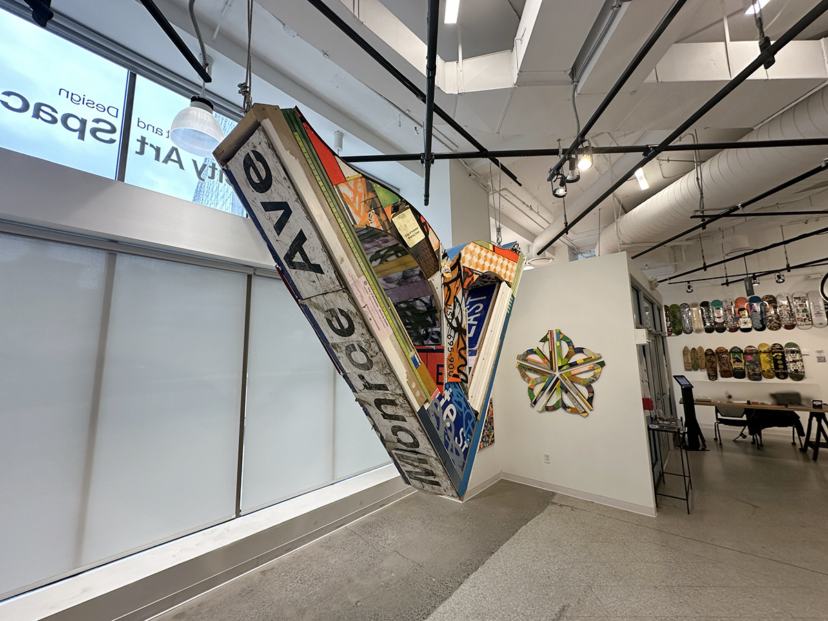
Erich S. Lehman ’97 (electronic media publishing), ’99 MS (crossmedia publishing), lead systems administrator/manager in RIT’s College of Art and Design, was also interviewed. Lehman, a leading light of the arts in Rochester, is curator of 1975 and the organizer and co-curator of the area’s public mural program, WALL\THERAPY. The city’s logomark has been incorporated into his murals and in an exhibition he curated at RIT City Art Space in 2024.
Provided by Erich Lehman
From RIT City Art Space's "SKETCHY" exhibition, these sculptures by Aaron Steffer — titled, from front, "Roc City Rustbelt" and "Rochester Reclaimed" — are an artistic ode to the city mark.
"My own relationship with the Rochester city mark has evolved over time," Lehman said. "Initially just an interesting design element I knew nothing about when I first encountered it back in the mid-90s, it has evolved into a shorthand icon for home and found family, perfect in its imperfection, and means so much more to Rochester residents than just a corporate logo for the city. It’s really quite a remarkable organic evolution."
Lorrie Frear, professor in RIT’s School of Design, was an intern for Green as an RIT student. She designed early city promotional materials using Green’s branding and called the flower mark “the official visual ambassador for all Rochesterians.”
“The combination of the iconic flour mill and lilac flower petal in an abstract design was a radical departure for governmental branding at the time,” Frear said. “It is inspiring to see the impact of the flower mark. Every time I walk into the classroom, there is a flower mark on a t-shirt, sticker, jewelry or as a tattoo. I have shared the flower mark story with many students, and every time it makes me smile.”
Public, free screenings of City Mark: A Rochester Icon are scheduled at multiple theaters into the fall.
RELATED: Lee Green and Erich Lehman join WXXI's Connections to discuss the city mark's origins and legacy.