Students, alumni, faculty clean up at annual advertising awards
Sam Kang
Advertising photography student Lizzie Soufleris accepts a Gold ADDY for a project she completed with classmates Adrian Ababovic, Maggie DiMarco
RIT’s College of Art and Design enjoyed a big night at the Rochester Advertising Federation’s 28th annual ADDY Awards on March 14 at the Joseph A. Floreano Riverside Convention Center.
The Rochester ADDY Awards bring together local professionals and college students to celebrate and recognize excellence in marketing and advertising. The local event is part of the American Advertising Awards’ three-tier national competition, with winners advancing to district and then national levels.
RIT students created projects that received Gold and Silver ADDYs in various categories while alumni played major roles on creative teams that made ad campaigns, videos and other media that garnered recognition. Additionally, School of Design adjunct faculty Chris Lyons received the Silver Achievement Award, a nomination-based honor given to an individual for their creative ability and contributions to the Rochester advertising industry and community.
Calabrese Studio, Myers Creative Imaging, Optic Sky Productions, Partners and Napier and Rich Brainerd Studios — local companies founded by RIT alumni Wayne Calabrese ’81 (professional photography), John Myers ’83 (photography), Aaron Gordon ’13 (film and animation), Sharon Napier ’04 (service leadership and innovation) and Rich Brainerd ’91 (professional photographic illustration), respectively — won a host of awards at the event. Many College of Art and Design alumni were part of the teams at those companies that won Gold and Silver awards, as well as other companies that were honored.
The RIT winners in the student categories were:
Gold
- Adrian Ababovic, Maggie DiMarco and Lizzle Soufleris (all advertising photography) in the Elements of Advertising - Still Photography category for Nella Notte campaign.
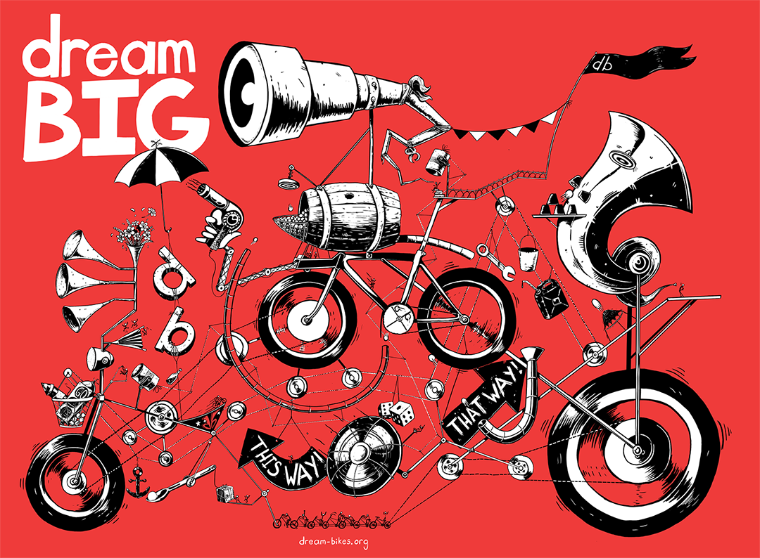
- Emilio Serrano (graphic design) in the Elements of Advertising - Illustration category for DreamBikes - Dream Big.
About the project, from the creator
My piece was made as part of (local printing company) Cohber’s “FUEL 2019: For the Good” calendar. The purpose was to create a piece demonstrating a collaborative team effort that amounts to one unified and harmonized project that cannot run without all of its pieces.
DreamBikes, a nonprofit organization, not only fixes and restores bikes, it also helps give jobs to teens who struggle to get employed. It helps these teens learn a new skill and helps contribute to a bigger cause.
Silver
- Clare Mahr (graphic design) in the Online/Interactive - App (Mobile or Web-based) category for VENU iOS app.
About the project, from the creator
VENU is a mobile app concept design that functions as every concert-goer’s personal concert database. It contains information on the user’s past and upcoming concerts, as well as suggested concerts based on previous shows. VENU enhances the experience during concerts as well, with a set countdown clock and “crowdsourcing” — a way for users to interact with others at the same concert in real time through profiles and games.
VENU is an app created not to replace concerts, but to make the concert experience more personal and enjoyable.
Silver
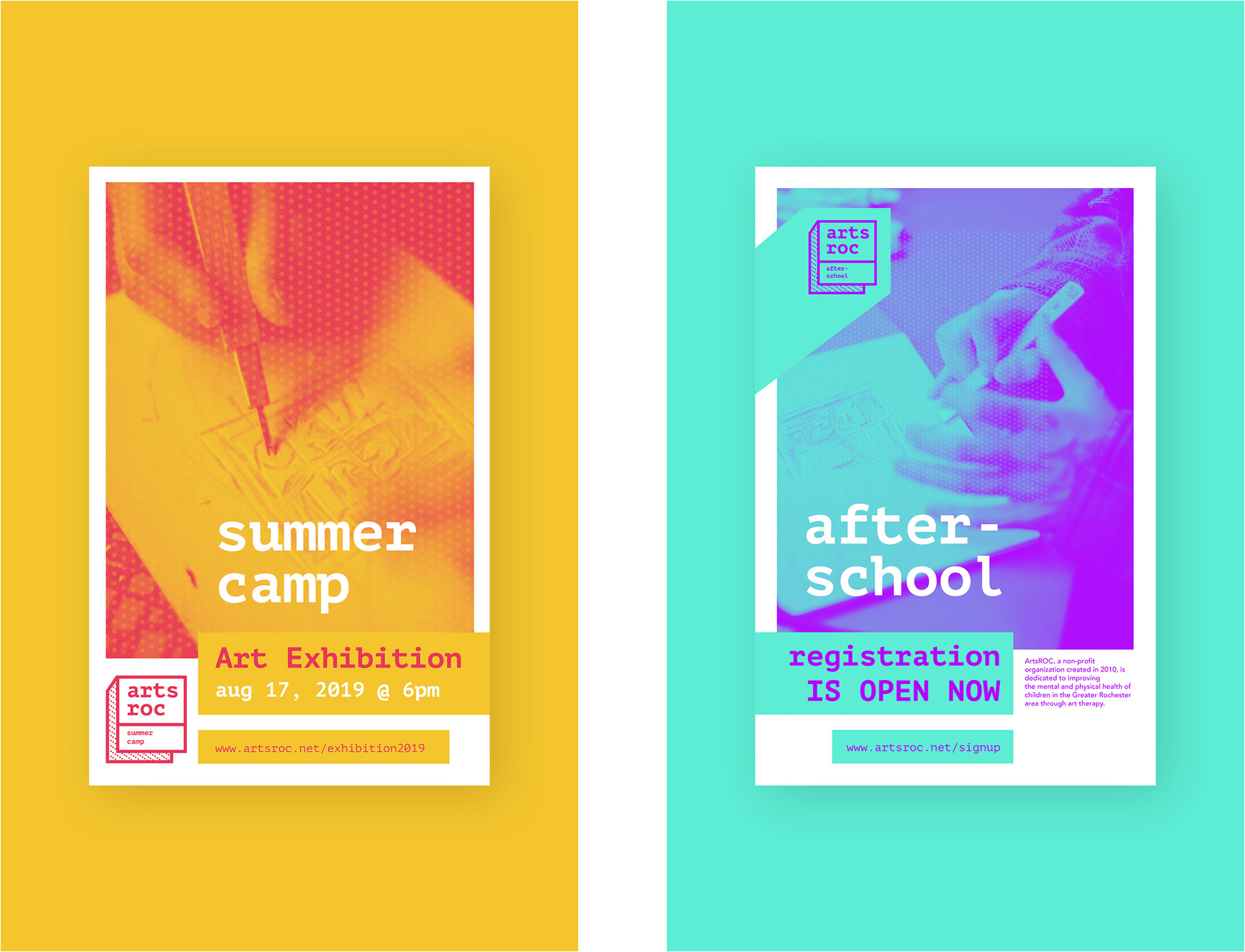
- Meeya Tjiang (graphic design) in the Cross-Platform - Integrated Campaigns category for ArtsROC: Rebrand Campaign.
About the project, from the creator
ArtsROC is a Rochester-based nonprofit organization dedicated to improving the mental and physical health of children through after-school and summer enrichment programs. This was a senior portfolio project of mine where I focused on rebranding the organization.
The primary desire of this campaign was to shift the organization’s focus to art therapy. ArtsROC’s current mission centers mainly on computer-based games, Legos and videography. I rebranded its mission to focus on supporting teens’ mental and physical health through art therapy.
Art is used to create healthy, stress-free experiences for teens to help disconnect themselves from their daily stresses. The growing epidemic of stress for teens is on the rise and they are under extreme pressure to do well in school, sports, etc., which results in increased anxiety, sleep deprivation and depression. Through this art therapy program, teens are empowered to let their creativity generate positive distractions.
The new brand goal for ArtsROC is also to make the program more attractive to teens and promote high energy and positive feelings. The main bold color brand, bright neon purple and blue teal, represents the excitement and fun that ArtsROC offers.
The new typeface and logo design delivers a modern digital, electric feel. In this art therapy program, teens would be able to participate in both digital and traditional art. My rebranding concept focuses on creating fun, exciting experiences for teens to reconnect with themselves through art therapy.